What comes with the form builder landing page template
- index.html: the pure HTML and CSS version, one single HTML file, 118 KB.
- index.gsap.html: the same design built with GSAP, ScrollTrigger and Lenis, for scroll motion in every browser, Firefox included.
- AGENTS.md: what a coding agent must keep and what to replace, so Claude Code, Codex or Cursor edit it without breaking the scenes.
- DESIGN.md: every colour, font, spacing and motion rule of this form builder landing page design.
- PROMPTS.md: the agent prompt and the design prompt below.
- CREDITS.md and LICENSE.md: the photos and fonts with their licenses, and the 8B license.
- Updates to this template, at no extra cost.
Yours to edit: one index.html with no build step, so you or a coding agent can change the words, prices and photos and upload it to any static host. Not a coder? Describe your business in one sentence to 8B's AI website builder and it designs a new site for you, with more pages when you need them. Designing is free; publishing with hosting is $9 a month, billed yearly. It also works inside Claude and ChatGPT.
Premium template · $39, one-time license · Made by 8B, an AI website builder · Updated November 2026 · Plain text: pliego.md
About this form builder landing page template
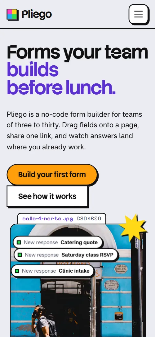
Form builder landing page template for a no-code tool or a small SaaS: one HTML file with a builder shown at work, six field types, four house rules, a build, share and collect flow, eight use cases, a shelf of form templates, integrations, three plans, questions and a contact form. The first screen sets a street photo with live response chips beside the headline, then the photo breaks into vivid square tiles and a form assembles itself field by field. It is a single HTML file in pure HTML and CSS, and a GSAP version of the same page comes with it.
At a glance, November 2026. One 118 KB index.html: a single HTML file in pure HTML and CSS with a few lines of built-in JavaScript, 13 sections, 8 Unsplash photos, Miranda Sans, Pixelify Sans and Stack Sans Notch. A GSAP build of the same page, 100 KB, comes with it.
It suits a form builder, a survey or booking tool, a no-code product for small teams, or any software that collects answers and needs to show how it works without a video. Form builder landing pages mostly need the same things on one scroll: what the product does in one line, the building blocks, how it works in three steps, examples to start from, where the answers go, plans with prices and a way to get in touch. This page gives each its own section, and it adds a studio story and a use-case finder so the product feels made by people rather than assembled from a kit.
The demo product is invented: Pliego, a form builder from a nine-person studio in Puebla, Mexico. Every plan, price, answer limit, destination, template and quote is demo copy to replace. The wording is plain and specific, so you can swap in your own product, market and language: the Puebla details, the Spanish plan names and the peso note are the first things to change if you sell somewhere else.
If you would rather not edit HTML at all, 8B, the AI website builder designs a site from one sentence about your product, with more pages when you need them. This template is for people who want this exact design in their own hands: one index.html with its CSS and its motion inside, which you or a coding agent can edit and host anywhere, next to the app it sells.
Good for:
What a form builder landing page needs
Visitors to a form builder page want to know what it does, how hard it is and what it costs. Here is how this template answers each of those.
- A clear promise on the first screen. A large heading, one lead paragraph and two buttons, with three response chips that show the product receiving answers.
- The product at work. A full-screen builder with a field palette and a form being filled in, ending in a Publish form button.
- The building blocks. Six labelled field types (choice, rating, date, upload, signature, address), each with a small example.
- How it works. Three chapters, build, share and collect, with numbered sub-steps beside a sticky stage that changes as you scroll.
- Examples to start from. A shelf of five form templates with a photo, a field count and a note each, plus a letter grid of eight use cases.
- Where the answers go. A band with a live form and five destinations, each showing a status when an answer arrives.
- Plans and a way to get in touch. Three plans with prices and limits, a short questions list and a contact form with team size and what the visitor wants to collect.
What it does not have is a working product, a sign-up flow or a checkout: the builder, the answers table and the destinations are drawn demos, and the buttons point to sections of the page. Link them to your own sign-up and checkout, and connect the contact form to a form service.
Form builder landing page design and motion
Palette
#ececf3 the pale cool grey canvas every frame sits on#121212 ink for all text, borders and hard shadows#ffffff frame and field fill#22aef7 sky blue for the integrations band, tiles and highlights#ffd816 yellow for highlights, tiles, the menu panel on phones and the main plan#ff3cc1 magenta for tiles, stickers and the progress bar#2fe04f green for live status, tiles and chosen options#ff9d0a orange of the main action button#5b2fd1 violet for frame tags and the second half of headings#55556a secondary text and frame sizes in the tagsFonts
- Stack Sans Notch: headings, buttons, titles and the wordmark, a bold grotesque with notched corners
- Miranda Sans: body text, form fields and labels
- Pixelify Sans: frame tags, step numbers and the letter grid
A cool grey canvas with white frames. Every main block sits in a frame with a hard black border and a hard offset shadow, and a small pixel-type tag above its top edge names it like a file with its size. The first screen is a two-column split with the heading on the left and a tall photo frame on the right, followed by a full-screen builder with a field palette on the left and a form on the right. The field kit is a dotted canvas of six frames in three columns; the flow is three chapters beside a sticky stage; the use cases are a letter grid beside a list; the template shelf is a single row of five cards; the integrations sit in a full-width blue band with pixel edges; the plans are three frames in a row. On phones the columns stack, the kit becomes one column and the palette wraps above the form.
The idea behind the page is a form being assembled on a canvas, square by square. Frames, tags and hard shadows make the page look like a working design canvas, and square pixel tiles in blue, yellow, magenta, green and orange carry every change between a photo and the product. Round pill buttons sit against sharp-cornered ones, and the plan cards go from sharp to round corners as they arrive.
What is on the form builder landing page page
- NavigationHeader with the wordmark and four-square mark, five links and a Try button, and a full-screen menu on phones
- Forms your team builds before lunch.Two screens: a notched heading, two buttons and a street photo with three response chips, then a form builder with a field palette and a form to publish
On load the heading rises out of its masks, the lead and buttons lift into place and the photo frame scales in; the response chips bob on a loop and a yellow starburst sticker spins. As you scroll, the photo breaks into square tiles that grow to cover it, the chips slide away to the left and the heading, lead and buttons drift up. Then the field types of the builder slide in, the form's fields drop into place one by one and the Publish form button turns orange.
- A field for every question. None of them to code.Six labelled field frames (choice, rating, date, upload, signature, address) on a dotted canvas
The six field frames start scattered and tilted across the canvas and slide and rotate into their grid cells as a dot grid fades in. On phones each frame settles on its own as it scrolls past.
- House rules for forms people actually finish.One wide frame with four abstract stickers and four rules for forms people finish
The tag slides up out from behind its frame, and each of the four rules is stamped into the frame in turn: it arrives lifted up and to the left, slightly larger and fading in, and settles onto its hard shadow.
- Build it, share it, read the answers.Three chapters (build, share, collect) with numbered sub-steps beside a sticky stage that changes state
As each chapter crosses the middle of the screen, the sticky stage swaps between the builder, the share screen and the answers table through a burst of vivid tiles, and the current chapter's number keeps its colour while the others turn white. A bar under the stage fills across the three chapters.
- Made at a long table in Puebla.A street photo and a story frame about the studio, its nine people and its support languages and days
The tag slides out from behind the photo, the photo arrives covered by square tiles that clear away, and the story frame is stamped onto the canvas.
- Your next form is already in here.A 16 by 8 pixel letter grid hiding eight words, and a list of the eight use cases
As the letter grid scrolls, each hidden word gets a coloured bar that grows behind it and its letters darken, while the matching use case in the list switches on, until all eight are found.
- Start from a form that already works.A sideways shelf of five form templates with photos, field counts and short notes
On scroll the row of five template cards slides sideways past the visitor while each photo drifts the other way inside its frame.
- Answers go where your team already is.A blue band with pixel edges: a live form on the left and five destinations with their statuses on the right
The blue band builds its pixel edge at the top as it arrives. A yellow square then leaves the live form along each dashed line and, on arrival, stamps the destination's status, and the bottom edge builds in the same way.
- Pay for the team, not for each form.Three plans (Puesto, Taller, Fábrica) with prices, limits and a note about pesos and non-profits
The three plans start stacked behind the middle one with sharp corners and fan out to their columns while their corners round off, and the main plan fills with yellow at the end. On phones the stacked cards only tilt and round off.
- Questions from the counter.Five questions in native accordions
Each question is stamped onto the canvas as it comes into view, one after another.
- Say hola. A person answers.A photo of a tiled shop window and an address card beside a contact form with name, email, team size and message
The shop-window photo resolves as its covering tiles shrink away while the address card slides out from behind it, with a slight tilt.
- ProductA pixel edge, the big pliego.example wordmark frame with one line, product and studio links and the legal line
The wordmark frame is stamped onto the canvas as the footer comes into view.
Before you publish the form builder landing page site
- Replace social preview image, favicon, email address, phone number and contact form (sends nothing yet) and the invented demo facts (names, prices, areas, quotes). AGENTS.md lists them.
- Try Pliego free in the header and the menu, and Build your first form on the first screen lead to
#pricingnow; point them to your sign-up or app address. - See how it works on the first screen lead to
#flownow; point them to keep as it is. - Use the bakery form, Use the class RSVP, Use the intake form, Use the hiring form and Use the catering quote on the template shelf lead to
#pricingnow; point them to the address of each template in your product, or one gallery page. - Start on Puesto, Try Taller for 30 days and Talk to us about Fábrica on the plan cards lead to
#contactnow; point them to your checkout or sign-up for each plan, and a sales contact for the top plan. - Privacy and Terms in the footer lead to
#contactnow; point them to your privacy policy and terms pages. - Header and footer section links lead to
#kit, #flow, #templates, #pricing, #puebla, #faq and #contact on the same pagenow; point them to keep as they are. - Scroll-driven animation runs when the browser supports it (Chrome, Edge and Safari today; Firefox does not yet) and the visitor has not asked for reduced motion. Otherwise each section shows its finished layout; the GSAP build, index.gsap.html, also plays the scroll motion in Firefox (it uses GSAP 3.13.0).
- The contact form sends nothing: connect it to a form service, your CRM or your own backend. The pure HTML and CSS version shows no thank-you line after sending; add one or send the visitor to a thank-you page. The GSAP version shows a thank-you line but sends nothing either.
- It is one page. Every button goes to a section of the same page or to the contact form: the plan buttons, template links, Privacy and Terms need your own sign-up, checkout and policy addresses. The product shown is a drawn demo, not a working builder.
- The field kit and the plan cards are built for six and three items, the flow for three chapters, the letter grid for eight words, the template shelf for five forms and the routes band for five destinations: a different count needs its layout and scene adjusted. Prices, plan limits and destinations are demo copy.
Questions about this form builder landing page template
What do I get for $39?
The form builder landing page template as a single HTML file, index.html, in pure HTML and CSS, a GSAP build of the same page as index.gsap.html, a DESIGN.md with every colour, font and motion rule, an AGENTS.md for coding agents, the agent prompt and the design prompt from this page, and CREDITS.md for the photos and fonts. Updates to this template are included.
Can I use this form builder template for client sites?
Yes. One purchase lets you build as many sites as you like with it, for your own product or for clients, and change anything. What it does not allow is selling or giving away the template itself, as a template, theme or kit, or putting its source in a public repository.
How do I change the plans, prices and form templates?
Each plan is one block of HTML with a name, a price, a short note, a list and a button, and each form template on the shelf is one card with a photo, a title, a note and a link. With Claude Code, Codex or Cursor you say it in a sentence, such as rename Taller to Team and make it $19 a month, and the agent edits the block; by hand you change the words. The plan cards are built for three and the shelf for five cards, so a different number needs its layout and scene adjusted, which the agent can do from AGENTS.md. Plans that match your real pricing page are what visitors will trust, so replace every demo limit and price.
Does the contact form work, and where do the buttons go?
The contact form asks for name, email, team size and what the visitor wants to collect, but it sends nothing until you connect a form service such as Formspree or Netlify Forms, or your own backend. The pure HTML and CSS version shows no thank-you line after sending, so point the form at a thank-you page or add one; the GSAP version shows a thank-you line but still sends nothing. The buttons for trying the product, the template links and the plan buttons point to sections of the same page; replace them with your sign-up and checkout addresses.
Will it work with Claude Code, Codex or Cursor?
Yes. Put index.html and AGENTS.md in your project and give the agent the prompt that comes with the template. AGENTS.md says which attributes the scroll motion reads, what to keep and what to replace, so the agent changes copy, plans, photos and colours without breaking the scenes.
What do visitors see in Firefox or with reduced motion?
Firefox does not support scroll-driven animations yet, so it shows every section in its finished layout, as does any browser when the visitor asks for reduced motion. If the scroll motion must also play in Firefox, use the GSAP build, index.gsap.html, which loads GSAP, ScrollTrigger and Lenis from a CDN.
More templates for apps and products
Other designs for software, apps and product launches.
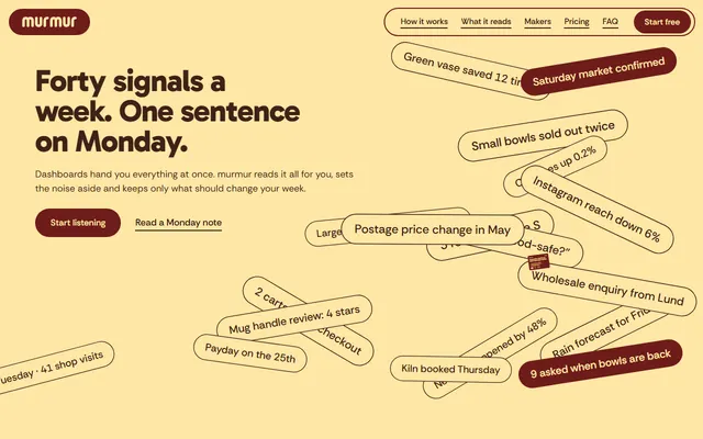
SaaS landing page for a weekly-advice app: signal chips, source columns, a phone, claims, two plans and a contact form.
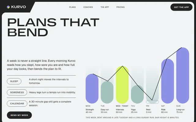
App landing page for a training app: an adaptive weekly plan, coaches, a phone, member stories, three plans and contact.
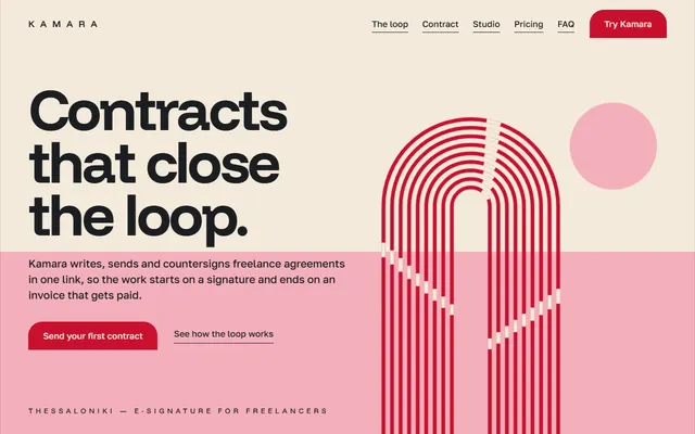
E-signature or SaaS app: product loop, feature sheet, three plans, quotes, FAQ and a contact form.
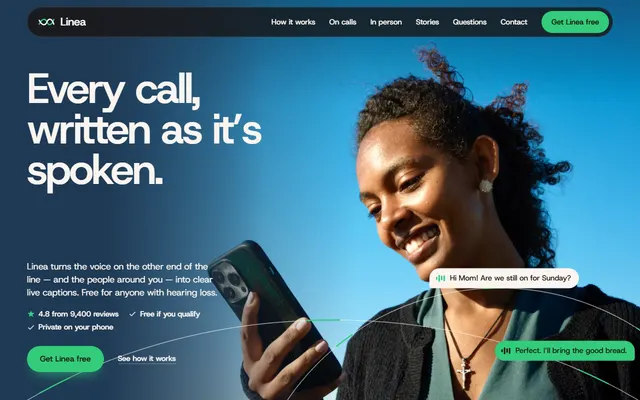
App landing page for a captions app: warm paper bands, a waveform turning into caption bubbles and a phone building its transcript.
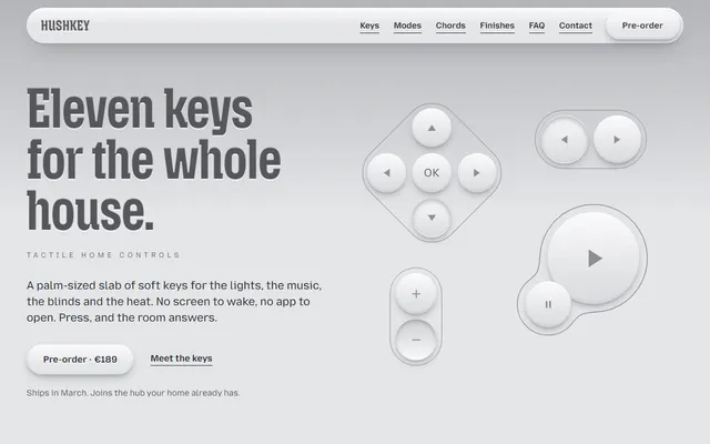
Product landing page for a smart-home remote: grey and tactile, with keys drawn in HTML and CSS that press and melt as you scroll.
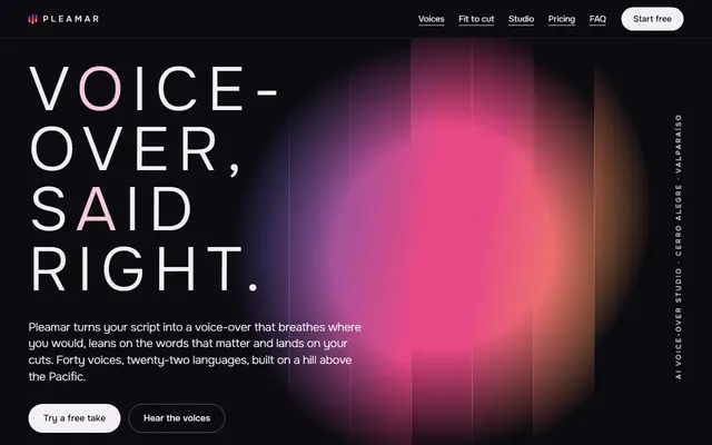
Voice-over or audio app: studio window, voice list, cut fitting, plans and a contact form.
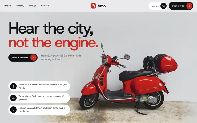
Electric moped: three models, plans, a ride form.
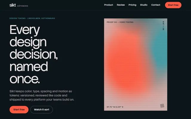
Developer tool or SaaS: a tilting product panel, a sorting scene, outputs, a review diff and pricing.