Free product landing page template
Repository: github.com/8bsite/product-landing-page-template · Live demo: 8bsite.github.io/product-landing-page-template/ · MIT license
About this template
Hushkey is a product landing page template for a device sold before it ships: a palm-sized smart-home remote with two finishes, a price and a ship date. It suits a gadget or IoT launch, a pre-launch page, or a waitlist once the pre-order buttons lead to a sign-up form.
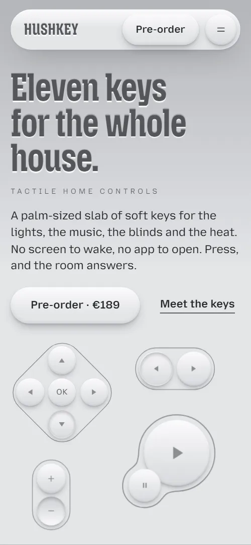
A one-page launch site for a palm-sized smart-home remote with eleven soft keys. Grey, tactile, monochrome; the keys are drawn in HTML and CSS and press, swell and melt into each other as you scroll.
Good for:
Free for personal and client work under the MIT license. In collections: one page website templates, github website templates, website templates with animation.
How to use the product landing page template
With an AI coding agent
Download the files into your project (Windows PowerShell: curl.exe):
curl -LO https://raw.githubusercontent.com/8bsite/product-landing-page-template/main/index.html
curl -LO https://raw.githubusercontent.com/8bsite/product-landing-page-template/main/AGENTS.md
curl -LO https://raw.githubusercontent.com/8bsite/product-landing-page-template/main/LICENSE
curl -LO https://raw.githubusercontent.com/8bsite/product-landing-page-template/main/CREDITS.mdThen give the agent this prompt:
Read AGENTS.md, then edit index.html. Use this template as the base for a launch page for <your product: what it is, who it is for, price, how to buy>. Keep the layout, the motion and the single-file format; replace the brand name, copy, photos, prices, links and contacts, and recolour it through the CSS variables if needed.Give the agent the file, not a link. AGENTS.md says what to keep and what to replace. Step by step: templates for Claude Code.
In a terminal
npx degit 8bsite/product-landing-page-template my-siteNo code
Download the ZIP, edit index.html and drag its folder onto Netlify Drop, or click Use this template and turn on GitHub Pages.
Product landing page design and motion
Palette
#e4e5e8 page background, key faces#232427 body text, shadows#fbfbfc highlights on keys and headings#55565b embossed headings#8d8e93 hairline outlines and contour lines#b4b5b9 top of the hero gradient#2c2d31 graphite FAQ, contact and footer bands#a9abb0 muted text on graphiteFonts
- Mozilla Headline: headings: condensed, bold, very large, embossed
- Mozilla Text: body and labels; small captions in spaced capitals
Soft monochrome neumorphism: keys, buttons and photo frames rise from or press into one cool grey surface, and headings look stamped into it. The device is drawn in HTML and CSS from round keys, a rotated diamond and contour lines. Material photos are cut as a pill, a circle and a square.
Motion runs on scroll; the list of sections below says what moves in each.
What is on the page
- NavigationTop bar: wordmark, section links, Pre-order button; phone menu overlay
- Eleven keys for the whole house.First screen: headline, two buttons, the eleven-key product panel drawn in HTML/CSS
Smooth scrolling runs page-wide; headings press into the surface on arrival. Scrolling on sinks and shrinks the drawn panel while its keys press one by one.
- Up is ready. Down is on.Keyboard of eight toggle keys (Up is ready / Down is on)
Tied to scroll, the eight keys grow into place in a diagonal wave; each one toggles up or down on click.
- One pad. Four moods of the house.Sticky stage: D-pad drives four room photos (Morning, Desk, Evening, Away)
Pinned while you scroll, the pad presses each direction in turn and that room's photo wipes in from the same side.
- Hold plus. The light arrives slowly.Fader + plus key over one room photo (grey to colour on scroll)
Tied to scroll, the room photo brightens from dark greyscale to full colour as the fader thumb travels to full.
- No screen to wake.Short statement: no screen, no app
- Press two at once. Get a third.Two keys meet and their outlines melt into one (chords)
Pinned while you scroll, the Lamp and Lock keys drift together until their outline melts into one shape, then Goodnight fades up.
- Made to be found in the dark.Three material cards with texture photos
- Two finishes. The same eleven keys.Two finishes (Chalk, Graphite) with pre-order buttons and a switch
Each finish panel tilts up from lying flat as it scrolls in; at the section's end a single key presses down.
- Before you press order.Questions and answers (native <details>)
The graphite background floods out of that key in a widening circle, tied to scroll, and the questions rise in.
- Ask someone who has pressed every key.Email, phone and a contact form (placeholders)
- FooterWidth-filling HUSHKEY wordmark, links, copyright and the Design: 8B credit
Tied to scroll, the width-filling HUSHKEY wordmark settles letter by letter, each brightening from muted grey as its shadow flips.
What is inside
- Files
index.html(115 KB, CSS and JavaScript inside),AGENTS.md,CREDITS.md,LICENSE- Motion
- GSAP 3.13.0 (ScrollTrigger, SplitText); Lenis 1.3.27 smooth scroll, loaded from jsDelivr. With reduced motion on, the page shows a complete static version.
- Fonts
- Mozilla Headline and Mozilla Text from Google Fonts (SIL Open Font License)
- Photos
- 8 from Unsplash (Unsplash License), loaded from Unsplash's servers and each credited in CREDITS.md
- Browsers
- Chrome and Edge 111+, Safari 16.2+, Firefox 113+ (it uses color-mix(), container query units, cascade layers, small/dynamic viewport units).
- Replace before publishing
- Social preview image, favicon, email address, phone number and contact form (sends nothing yet), plus the invented demo facts (prices, dates, addresses). AGENTS.md lists them.
- Lighthouse
- 93 on mobile, LCP 2.7 s, CLS 0
- License
- MIT
Good to know
- One page, no CMS: texts and prices are edited in the HTML, and there is no checkout or payment built in.
- Pre-order buttons in the hero and the nav lead to
#editionsnow; point them to your checkout, waitlist or store URL. - Pre-order Chalk / Pre-order Graphite in editions lead to
#contactnow; point them to the checkout URL of each finish. - The form sends nothing until you connect a form service such as Formspree or Netlify Forms, or your backend.
- Mid-wipe frames in modes show two half captions; it resolves within the wipe.
- The demo facts are invented. Photos load from Unsplash, the motion libraries from jsDelivr.
Questions about this product landing page template
Is the device a photo I must replace?
No. It is built from HTML elements and CSS shadows, so labels, icons and finish colours are editable code. It appears in the hero, modes, chords and finishes; swap those for your own product.
Do the pre-order buttons take payment?
No. They lead to the two finishes, whose buttons lead to the contact form. That form sends nothing until connected to a form service such as Formspree or Netlify Forms; or link the buttons to your checkout.
Prompt to rebuild it in any AI builder
No HTML file wanted? This prompt rebuilds the same look and scenes for your product in Lovable, Bolt, v0 or any other AI builder, in the stack you choose. Expect the same style adapted to your product, not a pixel copy.
Build a one-page product launch website for <product name: what it is, who it is for, price, how to buy>.

Look: soft, tactile, monochrome grey, like pressing real rubber keys. Page background #e4e5e8, text #232427, highlights #fbfbfc, outlines #8d8e93, secondary text #55565b, dark sections #2c2d31. Headings in "Mozilla Headline" (Google Fonts) bold 700 at 75% width, very large (up to 116px), line-height 0.9, colour #55565b with an embossed text-shadow (0 2px 1px #fbfbfc, 0 -1px 1px rgba(35,36,39,.3)). Body text "Mozilla Text" 17px/1.55. Every button, toggle and key is a soft raised shape (light gradient, soft drop shadow, a light inner top edge) that sinks in when pressed (an inner shadow layer fades in, the cap scales to 0.965). Thin 1.5px #8d8e93 outlines around groups of keys. Photos sit in rounded frames (radius 34px) that look pressed into the page (inner shadow, 10px padding).

Sections: floating pill nav; hero with a 3-line headline and the product drawn in HTML/CSS from round keys (no image); a 4×2 grid of toggle keys that really toggle; a sticky scroll stage where a four-way pad switches between four photos; a photo that goes from grey to colour while a fader thumb climbs; a three-line statement; two keys that glide together and merge into one gooey outline; three material photos in pill, circle and square frames; two product versions (light and dark) with prices; FAQ on a dark background with native <details>; contact form; footer with a huge wordmark filling the width.

Motion: smooth scroll; headings settle into the page as they enter; most scenes are tied to scroll position (scrubbed), with sticky stages for the four-photo switcher (340vh) and the merging keys (250vh). With "reduce motion" on, show a complete static page. Use GSAP with ScrollTrigger (or the closest equivalent in your stack). Mobile first, breakpoint 900px, max content width 1280px.The full prompt has a fill-in form for your product, the design system with exact values, one prompt per section and a checklist.