What comes with the newsletter platform landing page template
- index.html: the pure HTML and CSS version, one single HTML file, 133 KB.
- index.gsap.html: the same design built with GSAP, ScrollTrigger and Lenis, for scroll motion in every browser, Firefox included.
- AGENTS.md: what a coding agent must keep and what to replace, so Claude Code, Codex or Cursor edit it without breaking the scenes.
- DESIGN.md: every colour, font, spacing and motion rule of this newsletter platform landing page design.
- PROMPTS.md: the agent prompt and the design prompt below.
- CREDITS.md and LICENSE.md: the photos and fonts with their licenses, and the 8B license.
- Updates to this template, at no extra cost.
Yours to edit: one index.html with no build step, so you or a coding agent can change the words, prices and photos and upload it to any static host. Not a coder? Describe your business in one sentence to 8B's AI website builder and it designs a new site for you, with more pages when you need them. Designing is free; publishing with hosting is $9 a month, billed yearly. It also works inside Claude and ChatGPT.
Premium template · $39, one-time license · Made by 8B, an AI website builder · Updated November 2026 · Plain text: tidings.md
About this newsletter platform landing page template
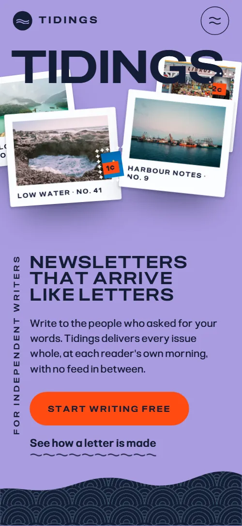
Newsletter platform landing page template for a product that sends letters: one HTML file with a writing desk, delivery at each reader's own morning, paid letters with a payout slip, an archive of back issues, a sheet of writers, reader replies, a move-your-list scene, two plans, questions and a contact form. It opens on a full-width wordmark over a pile of issue postcards and stamps, and a navy tide rises over the screen and carries the pile into one neat stack. It is a single HTML file in pure HTML and CSS, and a GSAP version of the same page comes with it.
At a glance, November 2026. One 133 KB index.html: a single HTML file in pure HTML and CSS with a few lines of built-in JavaScript, 13 sections, 24 Unsplash photos, Playwrite US Modern and Pliant. A GSAP build of the same page, 122 KB, comes with it.
It suits a newsletter platform, an email publishing tool, a creator subscription service or any SaaS that sends, delivers or archives letters. Newsletter platform landing pages mostly need the same things on one scroll: what writing looks like, how an issue reaches readers, how writers get paid, a few real-looking writers, the price and a way to get in touch, and this page gives each its own section. A newsletter platform built on a landing page like this also gets what sets it apart from a plain feature grid: paper objects, stamps and postmarks that make delivery feel like post.
The demo business is Tidings, an invented platform run from a small office in Orkney. Every writer, newsletter, reader, price, postmark and city is demo copy to replace. The delivery scene shows eight cities and a 07:00 line, so a product that sends on a different schedule, or in one country, changes the cities and the hour; the plans, the 8% fee and the payout figures are placeholders for your own pricing.
If you would rather not edit HTML at all, 8B, the AI website builder designs a site from one sentence about your product, with more pages when you need them. This template is for people who want this exact design in their own hands: one index.html with its CSS and its motion inside, which you or a coding agent can edit and host anywhere, next to the app it sells.
Good for:
What a newsletter platform landing page needs
A landing page for a newsletter platform answers the same questions fast: what it is, how it feels to write, how readers get the letters, how writers earn and what it costs. Here is how this template covers each of them.
- What it is, in one screen. A full-width wordmark, a tagline and a lede, with a free-to-start action and a link to see how a letter is made, then three facts: free for the first 1,000 readers, 8% of paid subscriptions, one-click export.
- How writing works. A postcard of an issue beside three steps, Write, Address and Post, so the editor, the segments and the scheduled send each get a sentence.
- How readers receive it. Eight city postcards cross a 07:00 line, one issue arriving in each reader's own morning, with the hour it left and its postmark.
- How writers get paid. A paid-letters section with three points and a payout slip that works the split out: readers, the platform's 8%, card fees and what the writer receives.
- Proof that real writers use it. A stamp sheet of six writers with newsletter, subject, readers and monthly price, plus four handwritten reader replies.
- A way to move from another platform. Two boxes and eight readers who move from Elsewhere into the product, with the promise that the list can leave any day.
- Plans and questions. Two plans on one perforated sheet, five questions and a postcard-shaped contact form with email and phone.
What it does not have is a sign-up flow, an editor, a login or a checkout: it is the page in front of your product. The buttons are ready to point to your own app, and your product handles accounts and payments.
Newsletter platform landing page design and motion
Palette
#a99be0 lavender: the page ground, the header and the menu#141d36 navy: text, the tide, the writers and footer grounds and the contact tide#a9e1e1 pale aqua: the paid, moving and questions sections and the type on the navy grounds#fbfcff paper white: postcards, stamps, slips, plan halves and the form#ff4b12 vermilion: stamp values, the main buttons, the Most read badge, the 07:00 line and the current step numberFonts
- Pliant: wordmark, stacked headings, labels, navigation, buttons, body text and form fields
- Playwrite US Modern: the handwritten asides, notes and reader replies
A lavender page with navy and pale aqua sections and paper-white cards that carry soft shadows. Every section heading is set in wide geometric capitals, stacked a few words to a line with a small label or a vertical side line, and short handwritten asides sit beside paper objects. The opening is a full-width wordmark over a pile of postcards and stamps with the tagline and two actions at the bottom left; below it the navy tide with the statement and three facts. The desk is one postcard beside three numbered steps, the archive is a grid of nine cards, the writers are a perforated sheet of stamps, and the plans are two halves of one perforated sheet. On phones the wide-only cards drop out and the pile sits above the text, the desk postcard sits above the steps instead of beside them and the plans stack.
The idea behind the page is letters carried in by the tide. Issues are paper objects on a lavender table, and a navy wave-patterned tide rises over the first screen, carries the paper into one stack and comes back as the ground of later sections. A hot vermilion marks stamp values, the main buttons, the morning line and the current step, and a two-tone wave pattern fills the tide, the writers, the footer and the aqua paid section.
What is on the newsletter platform landing page page
- NavigationHeader with the wordmark, six section links and Start writing, and a full-screen menu on phones
The header sits clear over the opening at the top of the page, takes a lavender fill as you scroll, hides on the way down and comes back when you scroll up; on phones a menu button opens a full-screen menu.
- Newsletters that arrive like lettersTwo screens: TIDINGS across the full width over a pile of issue postcards and stamps with the tagline and two actions, then the tide with the statement and three facts
On load the wordmark shifts up into place, the tagline lines wipe up and the cards drop onto the pile, and the cards then bob gently on their own. On scroll the navy tide rises over the screen, the cards lift off one by one as the waterline reaches them, level out and float into one neat stack, and the statement surfaces.
- Write it once. Sign it like a letter.The writing desk: an issue postcard beside three steps, Write, Address and Post
As the three steps pass, the postcard's message lines are written, the address rows slide in while the card turns level, then the stamp lands and the postmark presses on; the number of the step you are reading fills with vermilion.
- Sunday, 07:00, wherever they areEight city postcards with the hour each issue left and its 07:00 local postmark
The section holds still while the eight city postcards travel as one row across a vertical vermilion line, the reader's seven in the morning: left of it the patterned tide of the morning, right of it the lavender night. Each card that crosses turns level, gains its colour and gets its postmark.
- Readers pay you. We keep eight percent.Paid letters on aqua: the 8% promise, three points and a payout slip for 14 March with a PAID postmark
The heading rises line by line, the payout slip drifts across its resting place as you scroll and the PAID postmark lands, larger and turned, then pressed flat.
- Every issue keeps a homeNine back issues with number, title and date, one marked as most read
The nine back issues start as one turned, overlapping pile in the middle of the grid and are dealt out one by one into the grid in issue order.
- Writers on the same tideA stamp sheet of six writers with portrait, monthly price as the stamp value, newsletter, subject and readers
The heading rises; as the stamp sheet scrolls in, the stamp nearest its centre shrinks from a large size into its slot while the other stamps press into the sheet around it and the names follow.
- Readers write backFour handwritten reader replies on paper slips, each with a postmark
The heading rises, the four paper slips drift across their places as you scroll and each reply's postmark lands.
- Bring your readers with youTwo boxes, Elsewhere and Tidings, with eight readers who move from one to the other
The heading rises and the eight reader rows move one by one, turning slightly, from the Elsewhere box into the Tidings box until the old box is left with nothing behind.
- Two plans. That is all.One perforated sheet with two plans, Harbour at $0 and Open Sea at $12 a month
The two plans start as one perforated sheet and tear apart along the perforation, each half turning a little before it settles and uncovering the note between them.
- Questions, answeredFive questions in native details elements
The heading rises line by line.
- Write to the harbourA postcard-shaped form with the message on one half and the address on the other, with email, phone and office address
The heading rises and a navy tide with a wavy crest rises behind the postcard form, its pattern drifting.
- Letters worth waiting forFooter with a closing heading, one action, three back links and the company line
The closing heading rises line by line.
Before you publish the newsletter platform landing page site
- Replace social preview image, favicon, contact form (sends nothing yet), email address and phone number and the invented demo facts (names, prices, areas, quotes). AGENTS.md lists them.
- Start writing in the header, Start writing free in the opening, Set up your archive lead to
#pricingnow; point them to your sign-up or checkout page. - See how a letter is made in the opening lead to
#desknow; point them to keep it, or point it to a demo or a video. - Start free and Choose Open Sea on the two plans, and Write to us in the footer lead to
#contactnow; point them to your sign-up links for each plan, and keep Write to us on the form. - Logo, the six menu links, The first page, Our writers and Readers' replies links lead to
#opening, the sections, #writers and #repliesnow; point them to keep them. - Email and phone in the contact section lead to
mailto: and tel: with demo contactsnow; point them to your own email and phone, or remove the phone. - Scroll-driven animation runs when the browser supports it (Chrome, Edge and Safari today; Firefox does not yet) and the visitor has not asked for reduced motion. Otherwise each section shows its finished layout; the GSAP build, index.gsap.html, also plays the scroll motion in Firefox.
- The contact form sends nothing: connect it to a form service, your CRM or your mailing list. The pure HTML and CSS version shows no thank-you line after sending; only the GSAP build shows one. Both plan buttons and every Start writing button jump to a section until you point them to your sign-up.
- It is one page with no sign-up, editor, login or checkout: the buttons point to sections or to your own app. The 'Write it once' postcard, the payout slip and the writers are demo content, not a working product.
- The delivery scene is built for eight city postcards, the archive for nine back issues, the stamp sheet for six writers, the replies for four slips and the moving scene for eight readers: a different count needs its layout and scene adjusted.
Questions about this newsletter platform landing page template
What do I get for $39?
The newsletter platform landing page template as a single HTML file, index.html, in pure HTML and CSS, a GSAP build of the same page as index.gsap.html, a DESIGN.md with every colour, font and motion rule, an AGENTS.md for coding agents, the agent prompt and the design prompt from this page, and CREDITS.md for the photos and fonts. Updates to this template are included.
Can I use this newsletter template for client sites?
Yes. One purchase lets you build as many sites as you like with it, for your own product or for clients, and change anything. What it does not allow is selling or giving away the template itself, as a template, theme or kit, or putting its source in a public repository.
Does it include a sign-up, an editor or a checkout?
No. It is the landing page: the buttons jump to the pricing and contact sections, and the two plan buttons are ready to point at your own sign-up or checkout. With Claude Code, Codex or Cursor you say it in a sentence, such as send Start free to app.example.com/signup, and the agent changes the links; by hand you edit the href of each button. The writing desk, the payout slip and the writers are illustrations of your product, so replace them with what it really does. If you want a site with more pages that you edit without code, 8B's AI website builder makes one from a sentence about your product.
Does the contact form send messages?
Not yet. The form has a message, a name, an email and a field for your newsletter, and it sends nothing until you connect a form service such as Formspree or Netlify Forms, or your CRM. The pure HTML and CSS version shows no thank-you line after sending, so point the form at a thank-you page or add one; the GSAP version shows a short thank-you line under the button.
Will it work with Claude Code, Codex or Cursor?
Yes. Put index.html and AGENTS.md in your project and give the agent the prompt that comes with the template. AGENTS.md says which attributes the scroll motion reads, what to keep and what to replace, so the agent swaps the writers, issues, cities, plans and prices without breaking the scenes.
What do visitors see in Firefox or with reduced motion?
Firefox does not support scroll-driven animations yet, so it shows every section in its finished layout, as does any browser when the visitor asks for reduced motion. If the scroll motion must also play in Firefox, use the GSAP build, index.gsap.html, which loads GSAP, ScrollTrigger and Lenis from a CDN.
More templates for apps, SaaS and product launches
Other designs for products that live on a landing page.
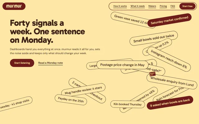
Weekly-advice app: a field of signal chips, a phone showing the weekly note, makers, two plans and a contact form.
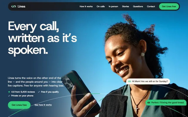
Free captions app: a waveform that becomes caption bubbles and a phone that builds its transcript feature by feature.
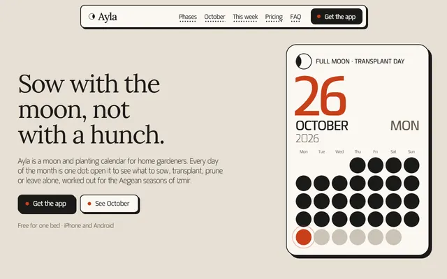
Gardening or planting calendar app: moon phases, a month of dots, plans, reminders and FAQ.
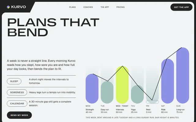
Training app: an adaptive weekly plan, coaches, a monthly challenge, three plans and questions.
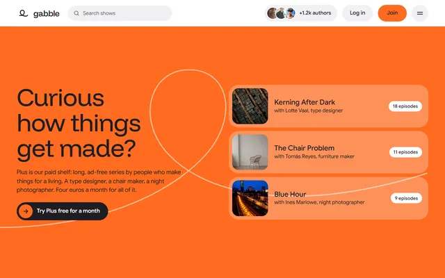
Podcast network: a paid shelf, a featured episode with a scrolling transcript and a grid of authors.
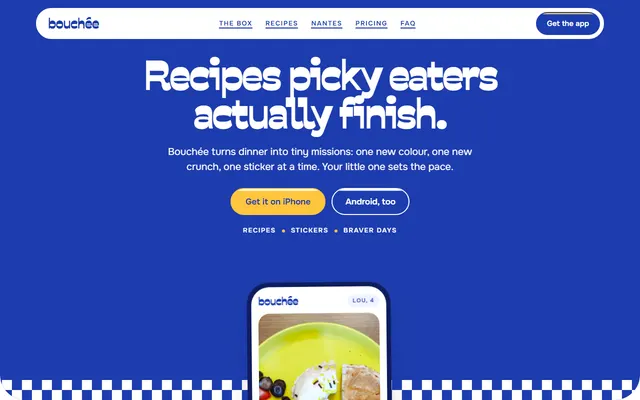
Recipe app: tasting ladders, swaps, this week's recipes, a sticker sheet, plans and FAQ.
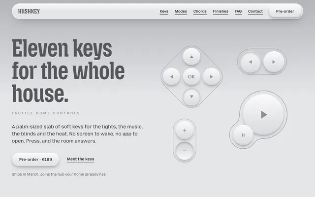
Product launch: a palm-sized remote with soft keys that press, swell and melt as you scroll.
E-signature or SaaS app: product loop, feature sheet, three plans, quotes, FAQ and a contact form.