What comes with the habit tracker app landing page template
- index.html: the pure HTML and CSS version, one single HTML file, 118 KB.
- index.gsap.html: the same design built with GSAP, ScrollTrigger and Lenis, for scroll motion in every browser, Firefox included.
- AGENTS.md: what a coding agent must keep and what to replace, so Claude Code, Codex or Cursor edit it without breaking the scenes.
- DESIGN.md: every colour, font, spacing and motion rule of this habit tracker app landing page design.
- PROMPTS.md: the agent prompt and the design prompt below.
- CREDITS.md and LICENSE.md: the photos and fonts with their licenses, and the 8B license.
- Updates to this template, at no extra cost.
Yours to edit: one index.html with no build step, so you or a coding agent can change the words, prices and photos and upload it to any static host. Not a coder? Describe your business in one sentence to 8B's AI website builder and it designs a new site for you, with more pages when you need them. Designing is free; publishing with hosting is $9 a month, billed yearly. It also works inside Claude and ChatGPT.
Premium template · $39, one-time license · Made by 8B, an AI website builder · Updated November 2026 · Plain text: smudge.md
About this habit tracker app landing page template
Habit tracker app landing page template for a small team with an app that has one clear idea: one HTML file with how the app works in four day marks, a colour for the day, a month where skipped days soften, six habits to start with, four app screens, six extras, eight reviews, a Free and a Plus plan, seven questions and a download section. It opens on a lilac poster in a thick outlined frame with a blurred orb that comes into focus as you scroll, the way a habit does in the app. It is a single HTML file in pure HTML and CSS, and a GSAP version of the same page comes with it.
At a glance, November 2026. One 118 KB index.html: a single HTML file in pure HTML and CSS with a few lines of built-in JavaScript, 13 sections, 6 Unsplash photos, Miranda Sans and Savate. A GSAP build of the same page, 104 KB, comes with it.
It suits an indie habit tracker, a routine, journaling, sleep or wellness app, or any mobile app with a free plan and a paid plan and a story that fits one sentence. Habit tracker app landing pages mostly need the same things on one scroll: what the app does differently, how it works, what the screens look like, what it costs and where to download it. This page gives each its own section, and a landing page built from it also carries the playful, outlined look that sets a small studio apart from a generic app page: colour as the product, thick ink frames with hard shadows and blunt copy.
The demo app is Smudge, an invented habit app made by two people in Wellington. Every name, price, review, address and feature is demo copy to replace. The page is written for an iPhone app with widgets and Apple Health, so for another platform or another idea you change the extras, the plans and the store button; the colour-and-focus idea can stay or be swapped for your own on the same structure.
If you would rather not edit HTML at all, 8B, the AI website builder designs a site from one sentence about your product, with more pages when you need them. This template is for people who want this exact design in their own hands: one index.html with its CSS and its motion inside, which you or a coding agent can edit and host anywhere, next to the app you already ship.
Good for:
What a habit tracker app landing page needs
Habit tracker app landing pages that turn visitors into downloads answer the same questions quickly. Here is how this template covers each of them.
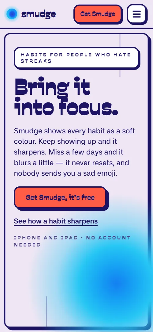
- One idea in the first screen. The heading Bring it into focus and a lead that says what the colour does, a download button and a link to how it works, in an outlined poster frame.
- How the app works. One habit over forty days in four day marks, from a smudge on day one to sharp on day forty, each with a short sentence.
- What it does differently. A section that shows the skipped day: the colour softens a step and comes back the next day, with a 31-day October grid beside it.
- What the app looks like. Four screens, Today, Habit, Month and Friends, as outlined cards with a caption each.
- A way to start. Six habit tabs, from running to sleep, each with a rhythm line and a tip, so the visitor sees their own habit on the page.
- Plans and prices. A Free card and a Plus card side by side with the price line, a short list and a button each.
- Trust and answers. Eight short reviews, seven questions on streaks, missed days, accounts, platforms and cancelling, and a closing section with support, press and a studio address.
What it does not have is a sign-up form, a waitlist, real screenshots or a Google Play button: the page links to the App Store and to email addresses, and the app screens are drawn cards you replace with your own text or images. A form service or a store link of your own fills each of these in a few lines.
Habit tracker app landing page design and motion
Palette
#efe6f4 lilac page ground and the shadow colour on the dark sections#1c1463 indigo ink: text, outlines, hard shadows and the indigo sections#1f5ef0 electric blue: the screens section ground#27c6f4 cyan: the heading echo, the habit orbs and the FAQ ground#d4f24c lime: the selected habit tab, the extras ground and the Plus plan#ff5d47 coral: the main buttons, the habit tabs section ground and the kept days of the month#ffffff cards, the app screens and the white sections#8b52ff violet: the glow behind the app screens and the deep tone of some habit orbsFonts
- Savate: headings, buttons and the letterspaced capital labels, in heavy weights
- Miranda Sans: body text, captions, the rows on the app screens and the FAQ answers
A lilac page whose sections sit on flat colour fields: white, indigo, electric blue, coral, lime and cyan, cut by thick ink rules. Every card, button, tag and app screen has a thick indigo outline and a hard offset shadow, and labels are small letterspaced capitals. The first screen is an outlined poster with the heading on the left and a blurred orb on the right; the second pairs a heading with the app's Today card. How it sharpens holds one orb on the left while four day marks scroll on the right; the month is a 31-day grid beside three day cards; the habit tabs share one white stage; the four app screens sit in a row; the extras are six cards in a grid of three columns; the reviews run in one row, or sit in a grid when motion is off; Free and Plus stand side by side. On phones the frames inset, the sharpen orb is held in a band under the header, the screens form a two by two grid, the extras drop to two columns and then one, and the plans stack.
The idea behind the page is focus. Smudge shows every habit as a soft colour that sharpens the more often you keep it and softens, never resets, when you skip. So the page is built from two materials at once: soft, blurred colour orbs held inside hard, outlined frames. The opening zooms from the framed poster into a close crop of the orb, section headings get a pale cyan echo that settles onto them as they arrive, and the contact frame closes in while its orb comes into focus, the opening in reverse.
What is on the habit tracker app landing page page
- NavigationHeader with the wordmark, five links and Get Smudge that hides as you scroll down and comes back as you scroll up, and a full-screen menu overlay on phones
- Bring it into focus.Two screens: an outlined poster frame with a blurred orb and Bring it into focus, then One habit. One colour. with the app's Today card
On load the poster frame settles into place, the orb blooms and the tag, heading lines, lead and buttons rise from below; a small lime orb circles the big one and the orb's core drifts inside its disc. On scroll the heading slips out of register into a cyan double exposure while the frame and orb scale up past the screen edges and the orb sharpens, until the sharp orb sits cropped at the right edge and the app's Today card rises over it, turning straight; on phones the orb stays low behind the card.
- How a habit sharpensOne orb held beside four day marks, Day 1, 6, 19 and 40, from a smudge to sharp
One orb is held while the four day marks scroll past: its halo tightens, its sharp disc fades in and a thin ring draws round it, and each mark lifts off its shadow as it reaches reading height.
- Your day, in one colour.Three habit orbs blending into one colour for the day, with a legend for cyan, coral and lime
Three habit orbs start small and soft in three corners of the square, drift inward, focus and overlap until they blend into the one colour of the day.
- Skip a day. Lose nothing.Skip a day. Lose nothing: three day cards and a 31-day October grid of kept and softer days
A diagonal wash paints the 31 day cells from pale and small to their own strength, and the three day cards swing in from the left one after another.
- What are you bringing into focus?Six habit tabs, running, reading, hydration, stretching, journaling and sleep, each with a photo, a rhythm and a tip
The stage lands pressed flat onto its shadow and lifts into it; each time you pick another habit tab, its photo fades up and grows into its circle while the soft halo behind it tightens.
- Four screens. That’s the app.Four app screens, Today, Habit, Month and Friends, as outlined cards with captions
On wide screens the four app screens are held in the middle of the screen as one stack and dealt out into their row, with the captions arriving last; on phones the two by two grid deals out from the first card's place.
- The quiet extrasSix small features: widgets, nudges that back off, Apple Health, buddies, export and no account
Each row of cards shears in from the opposite side to the row beside it, turned a little, and straightens as it locks into the grid.
- From people who quit three apps before this oneEight short reviews in a continuous row
The eight reviews run sideways in one continuous row, and the row pauses on hover or focus.
- Free, then Plus if you want it.Free and Plus plans side by side with prices and a button each
Plus starts tucked behind Free as its offset shadow and slides out beside it; on phones it comes out below.
- Fair questionsSeven questions in outlined accordion cards
Each question card lands pressed flat and lifts into its shadow once as it comes into view, in threes, each a beat after the one before.
- Bring one thing into focus.Closing frame with Download on the App Store, an email button, support and press addresses, studio address and reply time
The frame closes in from oversized to fitted while its orb comes into focus.
- FooterFooter with the wordmark and orb, three link columns and the company line
The orb beside the wordmark tightens its halo and fades its sharp disc in as the footer arrives.
Before you publish the habit tracker app landing page site
- Replace social preview image, favicon and email address and the invented demo facts (names, prices, areas, quotes). AGENTS.md lists them.
- Get Smudge in the header, Get Smudge it's free, Download free, Try Plus free for 14 days and Subscription terms lead to
#contact or #pricing on the same pagenow; point them to keep them or point them to your store listing. - Download on the App Store lead to
https://apps.apple.com/, the App Store home pagenow; point them to your app's own App Store address, and add a Google Play button if you have one. - Email the team, Support, Press and the footer's Press enquiries and Get support lead to
mailto links to demo addressesnow; point them to your own addresses. - Privacy in the footer lead to
#faq-data, the FAQ answer on accounts and datanow; point them to your privacy policy page. - Header links, How it works, Today, Screens, Pricing and FAQ, the footer's App list and Write to us, the wordmark, See how a habit sharpens and Why there are no streaks lead to
#sharpen, #today, #screens, #pricing, #faq, #contact, #opening and #month on the same pagenow; point them to keep them. - Scroll-driven animation runs when the browser supports it (Chrome, Edge and Safari today; Firefox does not yet) and the visitor has not asked for reduced motion. Otherwise each section shows its finished layout; the GSAP build, index.gsap.html (GSAP 3.13), also plays the scroll motion in Firefox.
- There is no form: the page links to the App Store and to email addresses. The App Store button points to the App Store home page until you put in your app's address, and there is no Google Play button.
- It is one page: the app screens are drawn in HTML and CSS as decorative cards, not screenshots, so a team that wants real screenshots replaces those cards with images. The hero orb blurs and sharpens on desktops with a mouse; elsewhere its sharp disc fades in.
- The month grid is built for 31 days, the screens deck for four screens and the pricing for two plans; a different count needs the layout and the scene adjusted. The habit tabs switch with CSS alone and are built for six. Extras and reviews take any count.
Questions about this habit tracker app landing page template
What do I get for $39?
The habit tracker app landing page template as a single HTML file, index.html, in pure HTML and CSS, a GSAP build of the same page as index.gsap.html, a DESIGN.md with every colour, font and motion rule, an AGENTS.md for coding agents, the agent prompt and the design prompt from this page, and CREDITS.md for the photos and fonts. Updates to this template are included.
Can I use this habit tracker template for client sites?
Yes. One purchase lets you build as many sites as you like with it, for your own app or for clients, and change anything. What it does not allow is selling or giving away the template itself, as a template, theme or kit, or putting its source in a public repository.
How do I change the plans, prices and features?
Each plan is one card with a name, a price line, a short list and a button, and each feature is one card with a title and a sentence. With Claude Code, Codex or Cursor you say it in a sentence, such as make Plus $4.99 a month and add a family plan, and the agent edits the cards; by hand you copy a card and change the words. The page holds two plans as built, so a third plan needs the layout and the scene adjusted; another feature card simply joins the grid. The plan buttons point to the page's own download section, which you point to your store listing.
Where do the App Store and the screenshots go?
The Download on the App Store button points to the App Store home page until you put in your app's own address; add a Google Play button next to it if you have one. The four app screens are drawn in HTML and CSS as decorative cards with a caption each. Replace the text inside them with your own, or swap a card for a screenshot image, and keep the four captions so the page stays readable without them. The page has no form and no email capture: the email button is a mailto link to your own address. To collect sign-ups, connect a form service of your choice and add the field to the download section.
Will it work with Claude Code, Codex or Cursor?
Yes. Put index.html and AGENTS.md in your project and give the agent the prompt that comes with the template. AGENTS.md says which attributes the scroll motion reads, what to keep and what to replace, so the agent swaps the app name, copy, screens, plans and reviews without breaking the scenes.
What do visitors see in Firefox or with reduced motion?
Firefox does not support scroll-driven animations yet, so it shows every section in its finished layout, as does any browser when the visitor asks for reduced motion. If the scroll motion must also play in Firefox, use the GSAP build, index.gsap.html, which loads GSAP, ScrollTrigger and Lenis from a CDN.
More templates for apps and software products
Other designs for a product page that explains an app or a service.
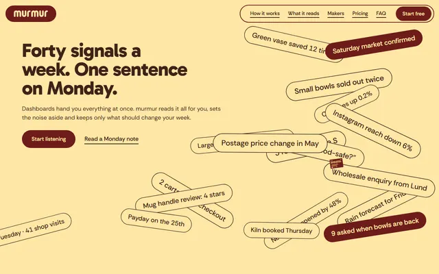
Weekly-advice app: a field of signal chips, five source columns, a phone showing the weekly note and four large claims.
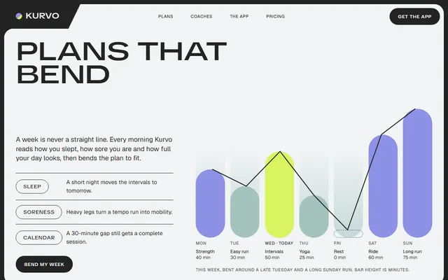
Training app: an adaptive weekly plan with a seven-day chart, coaches, disciplines, a monthly challenge and three plans.
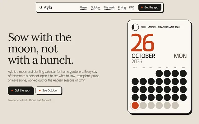
Gardening or planting calendar app: moon phases, a month of dots, plans, reminders and FAQ.
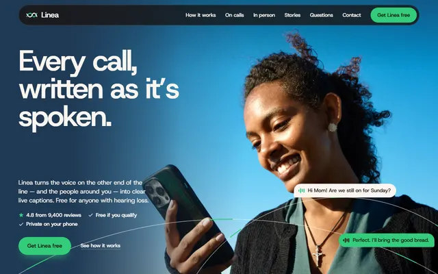
Free app that turns conversations into live captions, on warm paper and espresso bands.
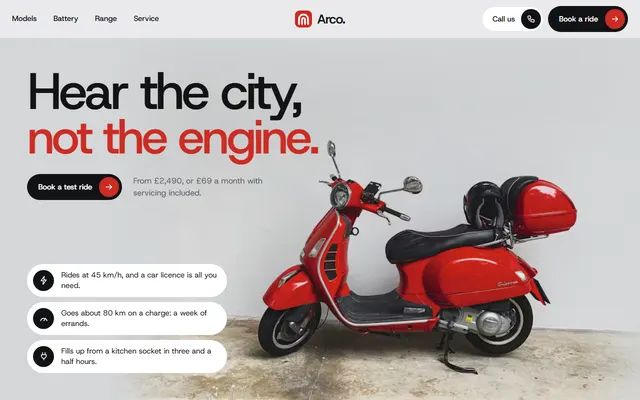
Electric moped: three models, plans, a ride form.
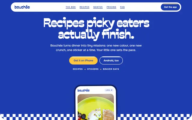
Recipe app: tasting ladders, swaps, this week's recipes, a sticker sheet, plans and FAQ.
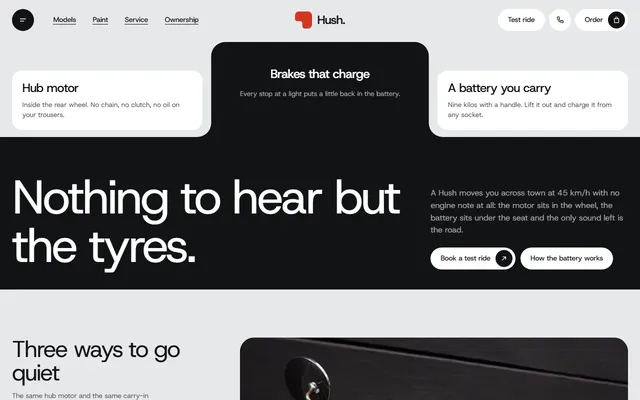
Electric scooter for moped makers: models, paints, plans.
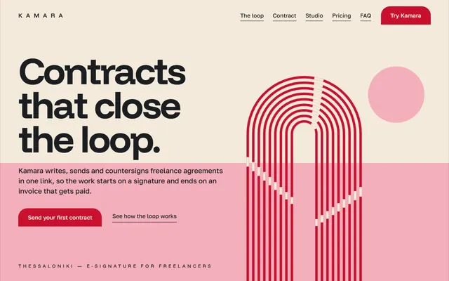
E-signature or SaaS app: product loop, feature sheet, three plans, quotes, FAQ and a contact form.