What comes with the blood donation website template
- index.html: the pure HTML and CSS version, one single HTML file, 114 KB.
- index.gsap.html: the same design built with GSAP, ScrollTrigger and Lenis, for scroll motion in every browser, Firefox included.
- AGENTS.md: what a coding agent must keep and what to replace, so Claude Code, Codex or Cursor edit it without breaking the scenes.
- DESIGN.md: every colour, font, spacing and motion rule of this blood donation website design.
- PROMPTS.md: the agent prompt and the design prompt below.
- CREDITS.md and LICENSE.md: the photos and fonts with their licenses, and the 8B license.
- Updates to this template, at no extra cost.
Yours to edit: one index.html with no build step, so you or a coding agent can change the words, prices and photos and upload it to any static host. Not a coder? Describe your business in one sentence to 8B's AI website builder and it designs a new site for you, with more pages when you need them. Designing is free; publishing with hosting is $9 a month, billed yearly. It also works inside Claude and ChatGPT.
Premium template · $39, one-time license · Made by 8B, an AI website builder · Updated November 2026 · Plain text: kindred-blood-service.md
About this blood donation website template
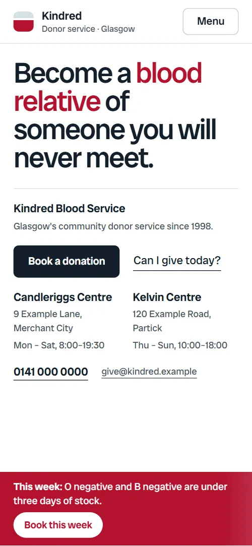
Blood donation website template for a donor service, a blood bank or a charity that runs mobile sessions: one HTML file with five ways to give, an eight by eight blood group table, the steps of a visit, donor eligibility, a timetable of mobile sessions, the team and a booking request form. It opens on type only, a two-tone statement with the centres, hours and phone in a strip under it and a red appeal strip, then a pale sheet slides over it and splits one donation into plasma, platelets and red cells. It is a single HTML file in pure HTML and CSS, and a GSAP version of the same page comes with it.
At a glance, November 2026. One 114 KB index.html: a single HTML file in pure HTML and CSS with a few lines of built-in JavaScript, 12 sections, 20 Unsplash photos, Radio Canada Big. A GSAP build of the same page, 96 KB, comes with it.
It suits a community blood service, a hospital donor team, a charity that runs donation sessions in town halls, or a campaign for plasma, platelets or a stem cell register. Blood donation websites mostly need the same things on one scroll: who can give, how long a visit takes, where and when to go, and a quick way to book. A blood donor website built from this page also answers the questions that stop first-time donors: does it hurt, can I give today, which blood groups can my blood reach, and what happens afterwards.
The demo service is Kindred, an invented donor service in Glasgow with two centres and six mobile sessions in October. Every name, address, phone number, date, number of chairs, donation interval and eligibility rule is demo copy to replace with your own approved wording. The sessions timetable and the centre cards take your towns and venues, so a service in another city or country changes the places, the hours and the rules and keeps the structure.
If you would rather not edit HTML at all, 8B, the AI website builder designs a site from one sentence about your service, with more pages when you need them. This template is for people who want this exact design in their own hands: one index.html with its CSS and its motion inside, which you or a coding agent can edit and host anywhere, next to the booking system or donor database you already use.
Good for:
What a blood donation website needs
A blood donor website has to turn a good intention into a booked chair. Here is how this template covers what a first-time donor looks for.
- A reason to give, in one sentence. The first screen is a statement, Become a blood relative of someone you will never meet, with the key words in red and the main actions right under it.
- Where, when and how to book. A strip on the first screen lists two centres with their hours, the phone and the email, Book buttons sit in the header, under the statement and on the appeal strip, and the page ends with a booking request form.
- What a donation is and who it helps. One donation is split into plasma, platelets and red cells, each with the patients it goes to, and five ways to give are listed with the time each takes.
- Can I give today. Twelve short chips sort into usually fine and wait a little, so most visitors know within a few seconds, and the six questions answer does it hurt, what to eat and how soon to return.
- What the visit looks like. Four steps with photos and minutes, from the fingertip check to the text that says which hospital the blood went to.
- Which groups the blood can reach. A real eight by eight compatibility table that fills donor by donor, so a donor can find their own group and read across.
- Sessions near me. A timetable of six mobile sessions with date, town, venue, hours and chairs left, each with a round button to book.
What it does not have is a live booking calendar, a chairs feed, a donor login or a map of sessions: it is built for a service that takes requests by a form or a phone call, or links its buttons to a booking system it already runs. The chairs left and the session dates are text you update, or connect to your own system.
Blood donation website design and motion
Palette
#ffffff page ground, card surfaces and text on the red and ink fills#13202b deep blue-black ink: headings, body text and the fill of the main buttons#b3122e blood red: the statement's key words, the appeal strip, the opening's veils, marks in the table and the line that fills across the visit steps#4a5560 slate for captions, meta lines and secondary text#eff4f6 pale cool ground of the opening's second screen, the donor quote, the team section, the booking form card and the footer#d6e0e4 hairlines, chip and field bordersFonts
- Radio Canada Big: the only family: the statement, headings, labels, table, chips and body text, at medium weights with tight tracking on large sizes
A white page with deep blue-black text, pale cool grey-blue panels and one blood red accent. The first screen is type only: a huge statement whose key words turn red, a hairline and a four-column strip with the service, two centres with hours and the phone and email, then a full-width red appeal strip. The second screen is a pale sheet with three photo bands, a short side column and a card of chairs still open today. Below, the ways to give are a ledger of rows with round arrow buttons beside a sticky photo frame; the blood group table is a real grid; the visit is four photo panels in a row; the sessions are rows ruled off by hairlines; the team is a facts list beside six portraits in three columns. On phones the bands stack full width, the ledger rows pass under the frame and the table keeps its eight columns at a smaller size.
The idea behind the page is that one gift reaches several people: the statement asks you to become a blood relative of a stranger, one donation is split into three parts that each go to a different patient, and the table shows how far each blood group reaches. Red is the only saturated colour: the statement's key words, the low-stock appeal, the table's marks, the waits before giving, the chairs free at each session and the hover fill of every button.
What is on the blood donation website page
- NavigationHeader with the name and a Donor service line, five links, a Book a chair button and a menu
- Become a blood relative of someone you will never meet.Two screens: a type-only statement with a fact strip and a red appeal strip, then a pale sheet that splits one donation into plasma, platelets and red cells with a card of chairs still open today
On load the statement rises into place, the four facts of the strip follow one after another and the appeal line rises; a lighter band then sweeps along the red appeal strip every few seconds. On the first scroll the pale second screen slides over the held first screen, which dims a little, carrying one red bar, the donation; the side heading arrives, the bar separates into three bands that settle into their own rows, then a red veil retracts from each photo one after another, each label slides in after its photo, and the card of free chairs arrives last.
- Five ways to giveFive ways to give in a ledger beside a sticky frame of five photos, each row with the time and a round arrow button
The heading rises. The photo frame stays in view while the rows pass: as each row crosses it, its photo rises into the frame over the previous one and the row's red marker grows.
- Who your blood can reachThe red cell compatibility table, eight donor groups by eight patient groups, filling one donor at a time
The table is held on screen while it fills one donor group at a time, from O negative, which reaches all eight groups, down to AB positive, which reaches one. The active row turns red as its marks pop in, and the staircase that builds up shows the compatibility rule.
- Donor voiceA donor quote on a pale band with her portrait and the years she has given
The quote rises into place and the donor's portrait opens from a red field that retracts to the right.
- Your hour, from door to teaFour steps of a visit on a sideways track with photos, minutes and a red line that fills
The heading rises, then the section is held while the four step panels slide sideways and a red line across the top fills, like the hour passing from the door to the text message.
- Can I give today?Twelve chips that sort into usually fine and wait a little
The heading rises. The twelve chips start as one mixed cloud and sort themselves into Usually fine and Wait a little as you scroll, each group's heading appearing as its chips arrive.
- On the road this monthA street photo and a timetable of six mobile sessions with date, town, venue, hours and chairs left
The heading rises, the street photo opens from a red field, and a hairline draws across under each of the six sessions.
- The nurses in the roomFour facts about the service beside six nurse and lab portraits in three columns
The heading rises and the six portraits arrive at different heights in three columns and come into line as the wall reaches the middle of the screen (two columns on phones), each portrait opening from a red field.
- Before your first donationSix questions before a first donation in details under hairlines
The heading rises; the six questions open and close as details elements, without a script.
- Book your chairPhone, email and two centres with hours and directions beside a booking request form
The heading rises. On desktops the whole column of heading, phone, email and centres starts centred and glides to its place while the booking form fades in and rises into the space it leaves; on phones only the form rises.
- FooterFooter with the service line, link columns, the donor line hours and the charity line
A hairline draws across above the charity line.
Before you publish the blood donation website site
- Replace social preview image, favicon, phone number, email address, map and contact form (sends nothing yet) and the invented demo facts (names, prices, areas, quotes). AGENTS.md lists them.
- Book a chair in the menu, Book a donation, Book this week, Take a chair and the round arrow buttons of the ways to give and the sessions lead to
#contact, the booking request formnow; point them to your booking system or booking page, or keep it once the form is connected. - Can I give today? and More questions lead to
#eligible and #faq on the same pagenow; point them to keep them, or point the second at your full donor rules. - Get directions and Find the centre lead to
Google Maps searches for the two centresnow; point them to map links to your own centres. - Phone and email links in the first screen, the contact section and the footer lead to
tel: and mailto: links with demo numbersnow; point them to your donor line and donor email, in all three places. - All sessions in the opening card, the footer's Give and Kindred links, and Directions lead to
#sessions, #ways, #team, #reach, #faq and #contact on the same pagenow; point them to keep them. - Privacy notice in the footer lead to
#contact, the booking sectionnow; point them to your privacy notice page. - Scroll-driven animation runs when the browser supports it (Chrome, Edge and Safari today; Firefox does not yet) and the visitor has not asked for reduced motion. Otherwise each section shows its finished layout; the GSAP build, index.gsap.html, also plays the scroll motion in Firefox.
- The booking request form sends nothing: connect it to a form service, your booking system or your donor database. Without a page script there is no thank-you line after sending; add one or send the visitor to a thank-you page.
- It is one page with no live booking calendar: every Book button goes to the request form, so a service with a booking system points the buttons at it. The chairs left in the opening card and in the sessions timetable are typed text, not a feed.
- The donation intervals, eligibility waits, compatibility table, centres, hours and session venues are demo copy written for a Glasgow service and simplified; a real donor service replaces every medical rule and date with its own approved wording.
- The compatibility table is built for eight groups, the ways ledger and its frame for five ways, the visit track for four steps, the eligibility cloud for twelve chips (six per group) and the team wall for six portraits: a different count there needs its layout and scene adjusted.
Questions about this blood donation website template
What do I get for $39?
The blood donation website template as a single HTML file, index.html, in pure HTML and CSS, a GSAP build of the same page as index.gsap.html, a DESIGN.md with every colour, font and motion rule, an AGENTS.md for coding agents, the agent prompt and the design prompt from this page, and CREDITS.md for the photos and fonts. Updates to this template are included.
Can I use this blood donation template for client sites?
Yes. One purchase lets you build as many sites as you like with it, for your own service or for clients, and change anything. What it does not allow is selling or giving away the template itself, as a template, theme or kit, or putting its source in a public repository.
How do I change the sessions, centres and eligibility rules?
Each session is one row with a date, town, venue, hours and chairs left, each centre is one small block, and each eligibility chip is one line of text. With Claude Code, Codex or Cursor you say it in a sentence, such as replace the six sessions with these dates and venues, and the agent edits the rows; by hand you copy a row and change the words. The wording of the donation intervals, waits and compatibility table is demo copy, so replace it with your own service's approved rules before you publish. The table has eight groups and the chip cloud has twelve chips, so a different count means adjusting the layout and the scene. If you want a site with more pages that you edit without code, 8B's AI website builder makes one from a sentence about your service.
Does the booking form send requests, and does it show free chairs?
Not yet. The form asks for a name, a phone number, the centre, the type of donation and a note, but it sends nothing until you connect a form service such as Formspree or Netlify Forms, or your booking system. The chairs left in the opening card and in the sessions timetable are typed text, not a live feed, so update them by hand or link the buttons to your own booking page. The pure HTML and CSS version shows no thank-you line after sending, so point the form at a thank-you page or add one.
Will it work with Claude Code, Codex or Cursor?
Yes. Put index.html and AGENTS.md in your project and give the agent the prompt that comes with the template. AGENTS.md says which attributes the scroll motion reads, what to keep and what to replace, so the agent swaps the service name, centres, sessions, rules and photos without breaking the scenes.
What do visitors see in Firefox or with reduced motion?
Firefox does not support scroll-driven animations yet, so it shows every section in its finished layout, as does any browser when the visitor asks for reduced motion. If the scroll motion must also play in Firefox, use the GSAP build, index.gsap.html, which loads GSAP, ScrollTrigger and Lenis from a CDN.
More templates for health, care and community services
Other designs for services that help people in the neighbourhood.
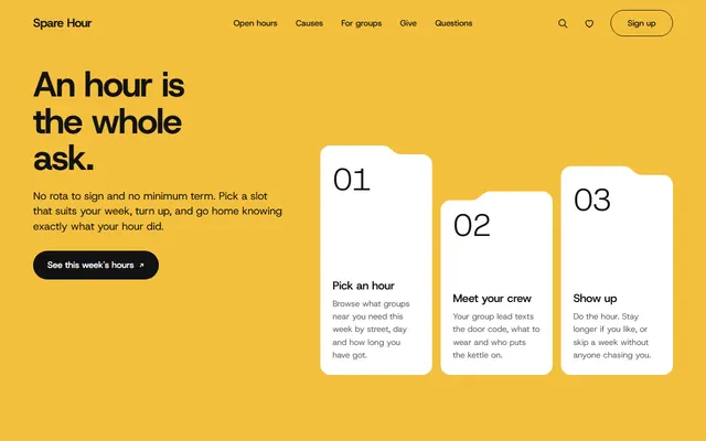
Volunteering network: a three-step explainer, open volunteer hours as folders, causes, a donation picker and a sign-up form.
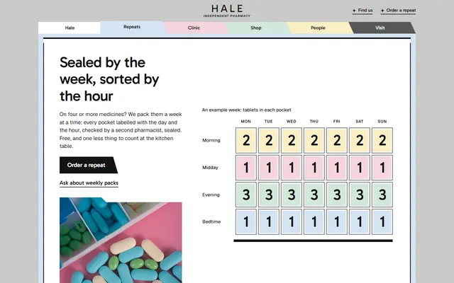
Neighbourhood pharmacy: weekly packs, a walk-in clinic, a vaccination table, opening hours and a form to order a repeat.
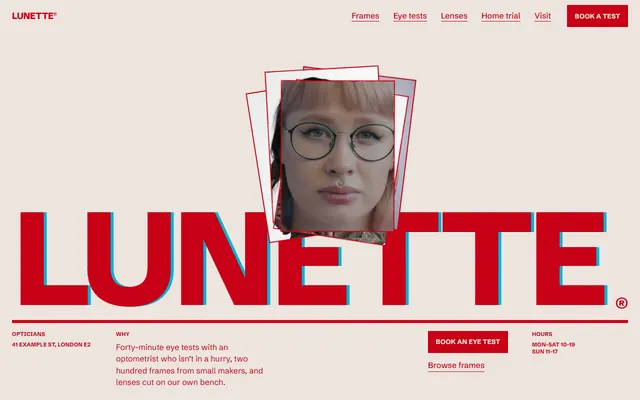
Optician: eye tests, a wall of frames, lens types, prices, a home trial and a booking form.
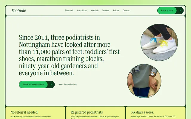
Podiatry clinic: the first visit in four steps, conditions, a price list, questions and a call-back form.
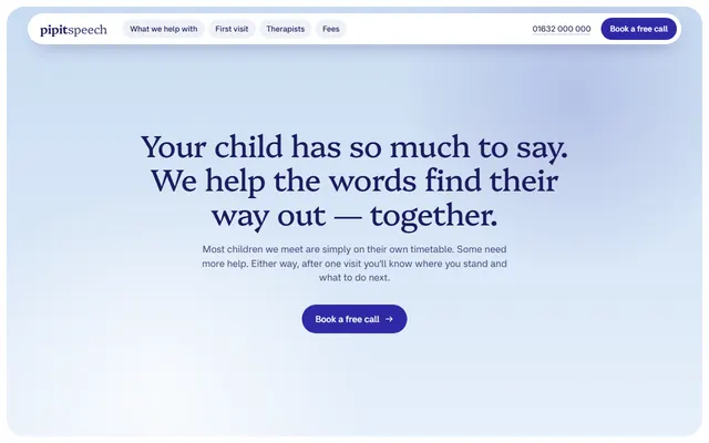
Speech therapy practice: five areas of help, a four-step first visit, four therapists, fees and a call request form.
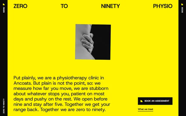
Physical therapy clinic: treatments, first visit, opening hours, prices and a booking form.
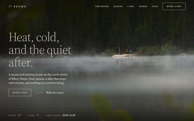
Sauna for a bathhouse or day spa: timed passes.
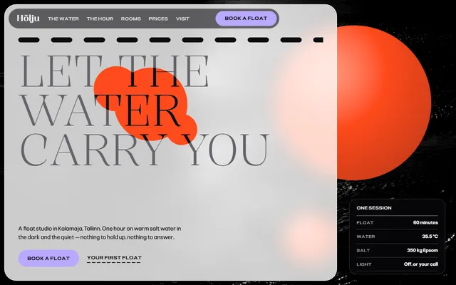
Float spa or wellness studio: the water, a session ticket, rooms, first-float guide, prices and a booking form.