What comes with the nutritionist website template
- index.html: the pure HTML and CSS version, one single HTML file, 130 KB.
- index.gsap.html: the same design built with GSAP, ScrollTrigger and Lenis, for scroll motion in every browser, Firefox included.
- AGENTS.md: what a coding agent must keep and what to replace, so Claude Code, Codex or Cursor edit it without breaking the scenes.
- DESIGN.md: every colour, font, spacing and motion rule of this nutritionist website design.
- PROMPTS.md: the agent prompt and the design prompt below.
- CREDITS.md and LICENSE.md: the photos and fonts with their licenses, and the 8B license.
- Updates to this template, at no extra cost.
Yours to edit: one index.html with no build step, so you or a coding agent can change the words, prices and photos and upload it to any static host. Not a coder? Describe your business in one sentence to 8B's AI website builder and it designs a new site for you, with more pages when you need them. Designing is free; publishing with hosting is $9 a month, billed yearly. It also works inside Claude and ChatGPT.
Premium template · $39, one-time license · Made by 8B, an AI website builder · Updated November 2026 · Plain text: burnet.md
About this nutritionist website template
Nutritionist website template for a dietitian or nutrition clinic: one HTML file with a signed founder statement, a credentials card, a seven-day food diary read line by line, six areas of help, a supermarket walk-round, the first appointment in four parts, the team, client plates, quotes, three fee rows and a booking form. The first screen is a row of referrers and one long mission statement signed by the founder, and as you scroll the credentials card opens out of a lime pill below it. It is a single HTML file in pure HTML and CSS, and a GSAP version of the same page comes with it.
At a glance, November 2026. One 130 KB index.html: a single HTML file in pure HTML and CSS with a few lines of built-in JavaScript, 13 sections, 22 Unsplash photos, Stack Sans Headline and Stack Sans Text. A GSAP build of the same page, 92 KB, comes with it.
It suits a registered dietitian, a nutritionist or nutritional therapist, a sports nutrition practice or a small clinic with a few practitioners, in person or by video. Nutritionist websites mostly need five things on one scroll: who is qualified and registered, what you help with, what a first appointment is like, what it costs and how to book. This page gives each of them its own section, and adds the parts that make a worried stranger trust a health professional: a typeset food diary with the dietitian's notes in the margin, named practitioners with their clinic days and real client meals.
The demo business is Burnet, an invented clinic of registered dietitians in Marchmont, Edinburgh. Every name, credential, fee, referrer, quote and place is demo copy to replace. The areas of help, the fees and the opening hours are plain text, so a clinic in another city or country swaps in its own regulator, currency, insurers and neighbourhood; the six areas and the three fee rows are the shape of the page, and the diary is one client's week that you rewrite for your own method.
If you would rather not edit HTML at all, 8B, the AI website builder designs a site from one sentence about your practice, with more pages when you need them. This template is for people who want this exact design in their own hands: one index.html with its CSS and its motion inside, which you or a coding agent can edit and host anywhere, next to the booking page or practice software you already use.
Good for:
What a nutritionist website needs
Nutritionist and dietitian websites that win bookings answer the same questions in the first minute. Here is how this template covers each of them.
- Proof that you are qualified. The credentials card names the regulator, the founder's training and clinic years, and three plain credential lines under a portrait.
- What you help with. An index of six areas, from gut health to sport to children, each with a sentence and its own photo.
- What the first appointment is like. Four parts with times, from listening to reading the diary to one agreed change and a written letter, and a food diary sheet that shows the method.
- Who the person is. Four practitioners with specialities and clinic days, client plates and three quotes in clients' own words.
- What it costs. Three fee rows with what each includes, the course marked as most chosen, and the cancellation line under the button.
- Insurance and referral questions. Six questions as native details, covering referral, insurers, the difference between a dietitian and a nutritionist, meal plans, bringing someone and cancelling.
- A way to book and a direct line. The contact card has the clinic's address, hours, phone, email and a request form with a choice of topic. Connect the form before you go live.
What it does not have is an online diary or a booking engine with live slots: the form takes a request, and you can link the Book button to your own booking page or practice software.
Nutritionist website design and motion
Palette
#ffffff page ground and the booking form#1b1c1a text, the dark pill buttons, the step numbers and the rules#e3eac4 the pale lime band: header, walk-round band, stories band, footer, the wash of the pill the credentials card opens from and the notes in the diary margin#cfd8da the cool start of the card gradient#e6ebeb inner panels, photo grounds and the middle of the card gradient#545955 captions, times, roles and secondary text#d3e486 the lime highlighter: marks under diary words, the travelling fee selection, button hover fills and the glow behind the statementFonts
- Stack Sans Headline: the statement, headings, fee prices, the questions and other large type
- Stack Sans Text: body text, navigation, captions, the diary lines, answers and form fields
A white page with near-black type in one soft grotesk at regular weight. A pale lime band hangs from the top edge with rounded bottom corners and returns as the stories band and as the footer rising from the bottom edge. Cards are large, rounded and shaded from grey-blue to lime, with lighter panels for portraits, steps and the street photo, and a white panel for the form. The first screen is a centred mission statement under a row of referrers; the diary is a sticky intro beside a white diary sheet on a grey-blue card; the areas are a large typographic index beside a photo window; the first appointment is four panels around a round photo. Portraits are black and white, food photos are in colour. On phones the referrers wrap into lines, the photo window sticks above the index and the steps stack in one column.
The idea behind the page is one shape: the lime band. It hangs from the top as the header, becomes the lime pill the credentials card opens from, gives the booking card its pill-shaped start, travels down the fee rows as a selection and closes the page as the footer. The voice of a person recurs in the signed statement, the notes in the diary margin and the quotes, so a clinic reads as people with a method, not a list of services.
What is on the nutritionist website page
- NavigationA pale lime band hanging from the top edge with the logo, four links and a Book a consult button; on phones a menu button opens a full-screen overlay with five links
The header band slides up out of view while you scroll down and returns on any scroll up; on phones the menu button opens a full-screen overlay with the links.
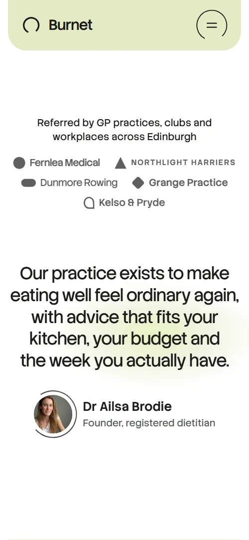
- Our practice exists to make eating well feel ordinary again, with advice that fits your kitchen, your budget and the week you actually have.Two screens: a row of five referrers and the founder's signed mission statement, then a credentials card with a black and white portrait, three credential lines and a team link
On load the referrers and the signature slide up and fade in, the statement shifts a few pixels into place, a lime glow drifts behind it and the ring around the founder's photo turns in a loop. On scroll the statement dims and sinks back, the glow swells, sinks and fades, the referrers lift away, the credentials card widens from a lime pill into its full shape while its lime wash fades into the grey-blue gradient, the portrait opens from a small circle and the heading, paragraph and three credentials arrive.
- We read your week before we say a word about itA sticky intro beside a seven-day food diary of thirteen lines with four dietitian notes in the margin
Each diary line inks from faint to full as it reaches the reading zone. On the four annotated lines a lime highlighter sweeps under the words and the dietitian's note slides out beside them, or rises under the line on phones.
- What people come to us withAn index of six areas of help beside a sticky photo window
As each area's row reaches the middle of the screen, its photo wipes up over the previous one in the sticky window while the photo settles from a slight zoom.
- The supermarket walk-roundA wide supermarket photo with a lime band over its lower edge: three plain items and an Add a walk-round button with a price
The wide photo opens from a small centred pill to its full rounded shape and the text and the three items rise in one after another.
- Your first ninety minutesFour step panels around a round consultation photo inside a thin ring: listening, reading the diary, one change, the letter
On desktop windows at least 700 px tall the stage holds while the four step panels slide out from under the round photo into their corners one at a time, and a thin ring draws itself around the photo, about a quarter for each step. On phones the panels slide down from under the photo into a column while the ring draws.
- The people you will seeFour dietitians as black and white portraits with a speciality and clinic days
Each portrait opens from a small centred pill and its caption rises in.
- Real plates from real weeksEight client meal photos in two rows with a dish line and a first name and age
The two rows slide in from opposite sides and each plate settles from a slight tilt, as if set down on a table.
- In their wordsThree client quotes on a lime band, one large and two beside it
The heading and the three quotes rise in one after another.
- FeesThree fee rows: first consultation, follow-up and the three-month course marked as most chosen, with a booking button and the cancellation line
One lime selection travels down the rows: a small pill around the price stretches to the full row, shrinks and moves on to the next, and the page rests on the three-month course.
- Questions we hear a lotSix questions as native details beside a heading and the clinic's phone
The heading and the line with the phone number rise in; the questions are native details that open and close without any script.
- Book a first consultationA grey-blue card with the clinic's address, hours, phone, email, a street photo and the booking form
The booking card opens from a small pill to its full shape while the street photo settles from a zoom.
- FooterA lime band rising from the bottom edge with the logo, five links, address, phone, email and the company line
Before you publish the nutritionist website site
- Replace social preview image, favicon, phone number, email address and contact form (sends nothing yet) and the invented demo facts (names, prices, areas, quotes). AGENTS.md lists them.
- Book a consult button in the header and the menu, Add a walk-round and Book a first consultation buttons lead to
#contactnow; point them to your online booking page, or keep #contact once the form is connected. - Header, menu and footer links lead to
#diary, #support, #team, #fees, #faq and #openingnow; point them to keep as they are. - Meet the team link in the credentials card lead to
#teamnow; point them to keep as it is. - What happens in the first appointment link lead to
#firstvisitnow; point them to keep as it is. - Phone and email links in the questions intro, contact card and footer lead to
tel:+441310000000 and hello@burnet.examplenow; point them to your clinic's number and email, in the link and in the visible text. - Scroll-driven animation runs when the browser supports it (Chrome, Edge and Safari 26.2 and later; Firefox does not yet) and the visitor has not asked for reduced motion. Otherwise each section shows its finished layout; the GSAP build, index.gsap.html, also plays the scroll motion in Firefox (GSAP 3.13).
- The booking form sends nothing: it has no handler and shows no thank-you line. Connect it to a form service or your booking system, and add a thank-you page or line.
- The food diary is built for thirteen lines with notes on the third, fifth, eighth and twelfth, the area index and photo window for six rows, the first-visit stage for four steps, the plate rows for four plates each and the fees for three rows: a different count needs its layout and scene adjusted.
- The first-visit stage holds while the steps slide out only on desktop windows at least 861 px wide and 700 px tall; on phones the steps slide out into a column without a hold, and on wide windows shorter than 700 px the four steps and the ring simply show in place. The page has no separate pages: every link goes to a section, and the fees, insurance wording, registration and referrers are demo facts for Edinburgh.
Questions about this nutritionist website template
What do I get for $39?
The nutritionist website template as a single HTML file, index.html, in pure HTML and CSS, a GSAP build of the same page as index.gsap.html, a DESIGN.md with every colour, font and motion rule, an AGENTS.md for coding agents, the agent prompt and the design prompt from this page, and CREDITS.md for the photos and fonts. Updates to this template are included.
Can I use this nutritionist template for client sites?
Yes. One purchase lets you build as many sites as you like with it, for yourself or for clients, and change anything. What it does not allow is selling or giving away the template itself, as a template, theme or kit, or putting its source in a public repository.
Does the booking form send requests anywhere?
Not yet. The form has fields for name, phone, email, what the person would like help with and a message, but it has no handler: it sends nothing and shows no thank-you line until you connect a form service such as Formspree or Netlify Forms, or your own booking system. Point it at a thank-you page or add a line of your own.
How do I change the fees, the areas of help and the team?
Fees, areas and people are plain text, so you replace the words, the prices and the currency. The page is built for three fee rows, six areas with six photos and four team members: keep those counts and the scenes work as they are, and ask a coding agent to adjust the layout and the scene if you want a different number.
Will it work with Claude Code, Codex or Cursor?
Yes. Put index.html and AGENTS.md in your project and give the agent the prompt that comes with the template. AGENTS.md says which attributes the scroll motion reads, what to keep and what to replace, so the agent changes copy, fees, photos and colours without breaking the scenes.
What do visitors see in Firefox or with reduced motion?
Firefox does not support scroll-driven animations yet, so it shows every section in its finished layout, as does any browser when the visitor asks for reduced motion. If the scroll motion must also play in Firefox, use the GSAP build, index.gsap.html, which loads GSAP, ScrollTrigger and Lenis from a CDN.
More templates for health and wellbeing practices
Other designs for practices that sell appointments, courses and classes by the hour.
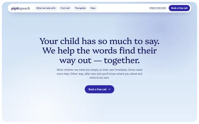
Speech and language therapy: five areas of help, a four-step first visit, four therapists and a parent message thread.
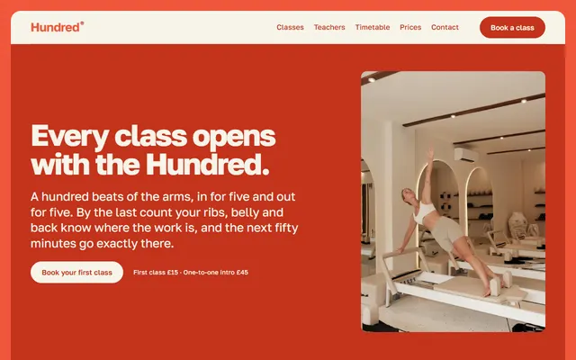
Reformer Pilates studio: four class formats, teaching rules, one class in order and teachers.
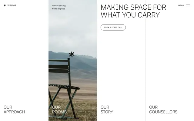
Counseling practice: approach, rooms, counselors, couples sessions, fees and a contact form.
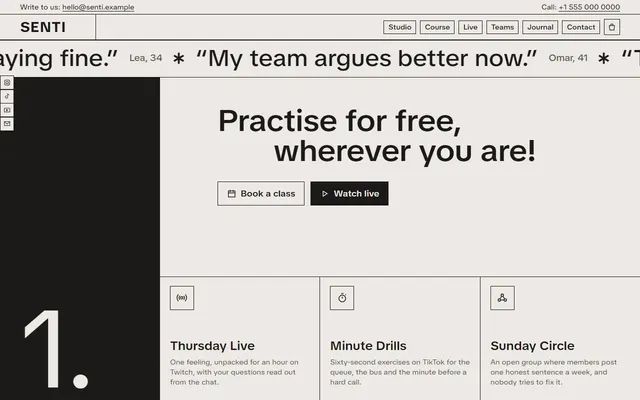
Wellness studio: a free first step, a paid six-week course and team workshops.
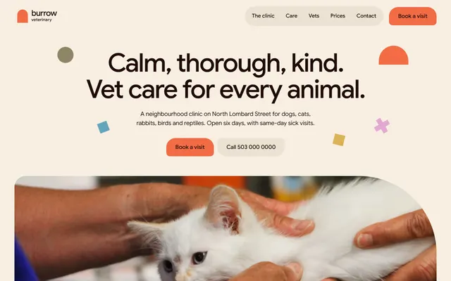
Neighbourhood vet clinic: services, vets, prices and a visit request form.
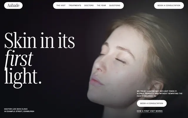
Skin clinic: a first visit plan, treatments with times and prices, doctors, a seasonal plan and a booking form.
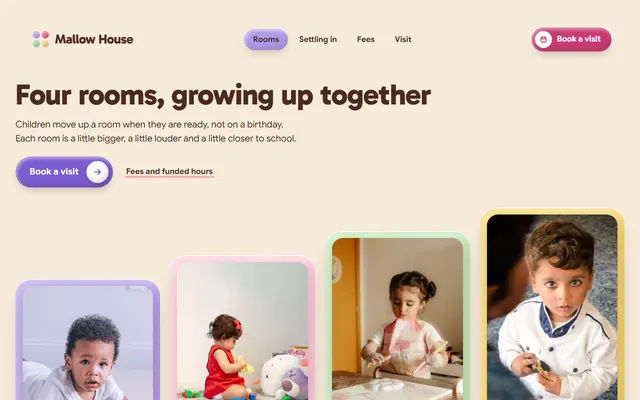
Day nursery: rooms by age, a settling-in plan, a weekly menu, fees and an open-morning form.

Dental clinic: same-day crown steps, treatments with prices, team, fees and a visit request form.