What comes with the dental clinic website template
- index.html: the pure HTML and CSS version, one single HTML file, 118 KB.
- index.gsap.html: the same design built with GSAP, ScrollTrigger and Lenis, for scroll motion in every browser, Firefox included.
- AGENTS.md: what a coding agent must keep and what to replace, so Claude Code, Codex or Cursor edit it without breaking the scenes.
- DESIGN.md: every colour, font, spacing and motion rule of this dental clinic website design.
- PROMPTS.md: the agent prompt and the design prompt below.
- CREDITS.md and LICENSE.md: the photos and fonts with their licenses, and the 8B license.
- Updates to this template, at no extra cost.
Yours to edit: one index.html with no build step, so you or a coding agent can change the words, prices and photos and upload it to any static host. Not a coder? Describe your business in one sentence to 8B's AI website builder and it designs a new site for you, with more pages when you need them. Designing is free; publishing with hosting is $9 a month, billed yearly. It also works inside Claude and ChatGPT.
Premium template · $39, one-time license · Made by 8B, an AI website builder · Updated November 2026 · Plain text: dentelle.md
About this dental clinic website template
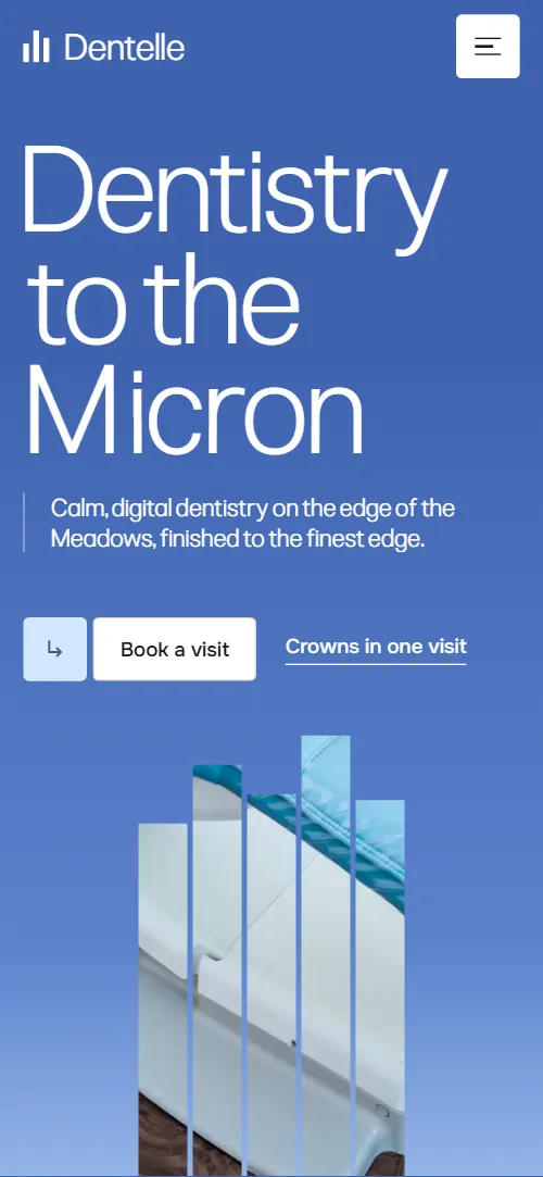
Dental clinic website template for a private practice that sells by the treatment: one HTML file with a same-day crown explained in four steps, a measured chart of the gap at the edge of a restoration, seven treatments with prices, five rules for nervous patients, the clinicians by name, full fees with a monthly membership card and a visit request form. It opens on a sky gradient with giant light words around a photo of a treatment room that stands up as an arch of slats, then spreads over the screen and lifts away. It is a single HTML file in pure HTML and CSS, and a GSAP version of the same page comes with it.
At a glance, November 2026. One 118 KB index.html: a single HTML file in pure HTML and CSS with a few lines of built-in JavaScript, 12 sections, 27 Unsplash photos, Onest and Pliant. A GSAP build of the same page, 101 KB, comes with it.
It suits a private dental practice, a family dentist, an implant or aligner clinic, an orthodontist or a hygienist with a room of their own. Dental clinic websites mostly need the same few things on one scroll: what you treat and what it costs, how the main treatment works, who the dentists are, how you look after people who are afraid, and a simple way to ask for a visit. This page gives each its own section, and it adds the two things that set a calm clinic apart: the explained method and the fees listed in full.
The demo business is Dentelle, an invented clinic in Marchmont, Edinburgh. Every name, price, hour, registration line and clinician is demo copy to replace, and the chart figures are typical values written for the template, not measurements. Prices are in pounds, so a clinic in another country changes the currency, the opening hours, the membership terms and the regulator named in the footer to its own.
If you would rather not edit HTML at all, 8B, the AI website builder designs a site from one sentence about your clinic, with more pages when you need them. This template is for people who want this exact design in their own hands: one index.html with its CSS and its motion inside, which you or a coding agent can edit and host anywhere, next to the booking system or practice software you already use.
Good for:
What a dental clinic website needs
A patient choosing a dentist wants the same answers quickly, and many are nervous before they read a word. Here is how this template covers each of them.
- What you treat and what it costs. Seven treatment cards with a price on each, and a fees section in four groups with every line priced, from a check-up to a single implant.
- How the main treatment works. The same-day crown is four steps, scan, design, mill and fit, with the chair time, the material and the fit stated beside them.
- Proof that the work is careful. A chart that sets the clinic's gap at the edge of a restoration against a putty impression made in an outside laboratory and the widest gap accepted in general practice, with a note that the figures are typical.
- Reassurance for nervous patients. The quiet room: five rules written as large lines, from raising a hand to stop, to sedation with a nurse beside you.
- Who you will meet. Five clinicians with portraits and roles, and a note that you can ask for the same dentist every visit.
- Families and regular patients. A membership card at a monthly price with what it includes, a free children's visit line and a school programme section.
- A simple way to ask for a visit. A request form for name, phone and best time to call, with the address, opening hours, phone and email beside it.
What it does not have is an online booking calendar, patient records or a payment page: the buttons lead to a request form that you connect to your reception, or to the booking widget you already use.
Dental clinic website design and motion
Palette
#ffffff page ground, text on the dark sections and the white end of the opening sky#1b1b1b near-black: text, the chart and contact sections and the dark card over the window photo#f1f5f8 pale grey: the approach, quiet room and fees sections#5b82cc cornflower blue: the sky, the clinic's own bar in the chart, the Little Teeth heading and the footer wordmark#3f63b0 deep blue: the top of the opening sky#d3e7ff pale blue: button icon tiles, the team note and the membership card#524f4b warm grey: the treatment cards and the other bars in the chartFonts
- Pliant: the light headings, the giant opening words, statements and card titles
- Onest: body text, labels, prices, navigation, buttons and form fields
A white page that alternates with pale grey and near-black sections. Headings are large and light, with a small label in a narrow left column and the statement in the wide right column, and buttons are a small pale square icon beside a bordered label. The first screen is a blue sky gradient with three giant words staggered across it and the photo arch between them; the same-day crown is a list of four photo plates; the treatments are a row of grey cards with a photo, a badge, a sentence and a price; the fees are definition lists under thin rules beside a pale blue membership card. On phones the opening words stack one to a row, the arch has five slats instead of seven, the crown plates sit beside short texts and the team grid has two columns under a wide first portrait.
The idea behind the page is the lace edge: the name means little tooth, and the clinic's promise is patience at the edge where a crown meets the tooth. So the opening is made of slats that spread and lift like the scalloped border of lace, the chart measures the gap in microns, and the corners of the page are tight at four pixels.
What is on the dental clinic website page
- NavigationHeader with the wordmark, six links and Book a visit; below 900 px a menu button opens the same links full screen
The header sits clear over the sky with white text and switches to a solid white bar with dark text once most of the first screen has scrolled past; past the top 120 px it slides away while you scroll down and comes back when you scroll up.
- Dentistry to the MicronTwo screens: giant words Dentistry to the Micron around a photo arch of slats on a sky gradient, then the name Dentelle as a dictionary entry beside a statement about the 40 micron edge
On load the three heading words rise, the arch comes up from below and the subtitle and buttons slide in; a pale scan band travels down through the photo in a loop. On scroll the slats spread over the whole width until the treatment room is seen through thin gaps, the words part sideways, and then the slats lift one by one in an uneven order like a scalloped edge, uncovering the white dictionary screen whose blocks settle up.
- Old craft, new instrumentsOld craft and new instruments: a paragraph, a wide window photo with a dark card about rooms with a view, and a statement about seeing your own scan
The heading and the statement rise line by line, and the window photo slides slowly inside its frame against the scroll.
- A crown before lunchA crown before lunch: four specifications and four steps (scan, design, mill, fit), each a photo plate with a short text
The four photo plates start gathered in one tilted stack, come apart down the list and settle flat as four rows, each beside its step text.
- Measured at the edgeA dark chart in microns with tabs for crown, inlay, veneer and bridge, three bars each and a hair-width marker at 70 microns
A thin cursor sweeps across the scale while the bars fill; the clinic's bar, the shortest, is full first and the others finish after it, and each label brightens as its bar is full. The tabs for crown, inlay, veneer and bridge switch the bars in plain CSS, so they work with the motion off too.
- TreatmentsSeven treatment cards, each with a photo, a title, a sentence and a price, on a horizontal track when the motion runs and in a grid without it
The seven cards form one horizontal track that travels sideways as the section scrolls, while each photo shifts inside its frame against the travel.
- The quiet roomThe quiet room: a paragraph and a photo beside five house rules for nervous patients
The heading rises line by line, the side photo drifts inside its frame and a thin rule draws across above each of the five rules.
- The people behind the chairFive clinician portraits with roles, and a note card about seeing the same dentist every visit
The five portraits are dealt from one stack into the grid and settle flat, and the supporting sentence rises line by line.
- Fees, in fullFees in four groups of price lists beside the Dentelle Care membership card at 19 pounds a month
The heading rises line by line and a rule draws across above each of the four fee groups.
- Little TeethA fill-width Little Teeth heading, a paragraph about the school programme and a looping row of six school photos
The Little Teeth heading thins from a heavy weight to the page's light weight while the school photos grow from about half size to full size; the row then keeps sliding sideways in a slow loop.
- Come in for a quiet check-upA dark block with a visit request form, two photos, the address, opening hours, phone and email
The heading rises line by line and the two photos drift inside their frames.
- FooterBlack footer with the wordmark filling the width, two link lists, phone, email and the company line
Before you publish the dental clinic website site
- Replace social preview image, favicon, contact form (sends nothing yet), phone number and email address and the invented demo facts (names, prices, areas, quotes). AGENTS.md lists them.
- Book a visit buttons in the header, the menu and the first screen, and Book with a named dentist in the team note lead to
#contactnow; point them to your online booking page, or keep #contact once the form is connected. - Crowns in one visit, How we work, Meet the clinicians and See all fees links lead to
#visit, #approach, #team and #feesnow; point them to keep as they are. - Header, menu and footer links, the wordmark and Back to the top lead to
#approach, #visit, #treatments, #team, #fees, #contact and #openingnow; point them to keep as they are. - Join Dentelle Care button in the membership card lead to
#contactnow; point them to your membership sign-up page, or remove the card if you have no plan. - Invite us to your school link in the school programme lead to
#contactnow; point them to a contact form for schools, or remove the section. - Phone and email links in the contact section and the footer lead to
tel:+441310000000 and hello@dentelle.examplenow; point them to your reception's number and email, in the link and in the visible text. - Scroll-driven animation runs when the browser supports it (Chrome, Edge and Safari today; Firefox does not yet) and the visitor has not asked for reduced motion. Otherwise each section shows its finished layout; the GSAP build, index.gsap.html, also plays the scroll motion in Firefox.
- The visit request form sends nothing: connect it to a form service or your practice software. Without a page script there is no thank-you line after sending; add one or send the visitor to a thank-you page.
- It is one page with no online booking calendar: every booking button goes to the request form, so a clinic with a booking widget points the buttons at it.
- The team grid and its dealing scene are built for five portraits, the crown steps for four plates and the quiet room for five rules: a different count there needs its layout and scene adjusted. The treatment track takes more or fewer cards as it is.
- The chart values, prices, hours and registration line are demo copy for a clinic in Edinburgh, written for the template and not measured; replace them with your own figures, or remove the chart if you cannot stand behind it.
Questions about this dental clinic website template
What do I get for $39?
The dental clinic website template as a single HTML file, index.html, in pure HTML and CSS, a GSAP build of the same page as index.gsap.html, a DESIGN.md with every colour, font and motion rule, an AGENTS.md for coding agents, the agent prompt and the design prompt from this page, and CREDITS.md for the photos and fonts. Updates to this template are included.
Can I use this dental clinic template for client sites?
Yes. One purchase lets you build as many sites as you like with it, for your own clinic or for clients, and change anything. What it does not allow is selling or giving away the template itself, as a template, theme or kit, or putting its source in a public repository.
How do I change the treatments, prices and team?
Each treatment card, fee line and clinician is one short block of HTML, so by hand you copy a block and change the words. With Claude Code, Codex or Cursor you say it in a sentence, such as change the crown to 650 and add a hygienist called Mira, and the agent edits the blocks. The treatment track takes more or fewer cards as it is. The team grid and its dealing scene are built for five portraits, the crown steps for four plates and the quiet room for five rules, so a different count there means adjusting the layout and the scene. Most treatment prices appear twice, on the card and in the fees list, so ask the agent to update both.
Can patients book an appointment on the page?
The page has a visit request form: name, phone, the best time to call and a note. It sends nothing until you connect it to a form service such as Formspree or Netlify Forms, or to your practice software, and the reception then calls back to agree a time. Every Book a visit button goes to that form. If your clinic uses an online booking widget, point the buttons at it and keep the form for people who prefer a call. The pure HTML and CSS version shows no thank-you line after sending, so send the form to a thank-you page or add one.
Will it work with Claude Code, Codex or Cursor?
Yes. Put index.html and AGENTS.md in your project and give the agent the prompt that comes with the template. AGENTS.md says which attributes the scroll motion reads, what to keep and what to replace, so the agent swaps names, treatments, prices and photos without breaking the scenes.
What do visitors see in Firefox or with reduced motion?
Firefox does not support scroll-driven animations yet, so it shows every section in its finished layout, as does any browser when the visitor asks for reduced motion. If the scroll motion must also play in Firefox, use the GSAP build, index.gsap.html, which loads GSAP, ScrollTrigger and Lenis from a CDN.
More templates for clinics and care
Other designs for health, care and neighbourhood practices.
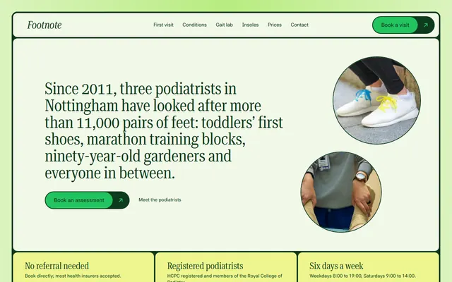
Podiatry clinic: the first visit in four steps, conditions, custom insoles, three podiatrists, a price list and a call-back form.
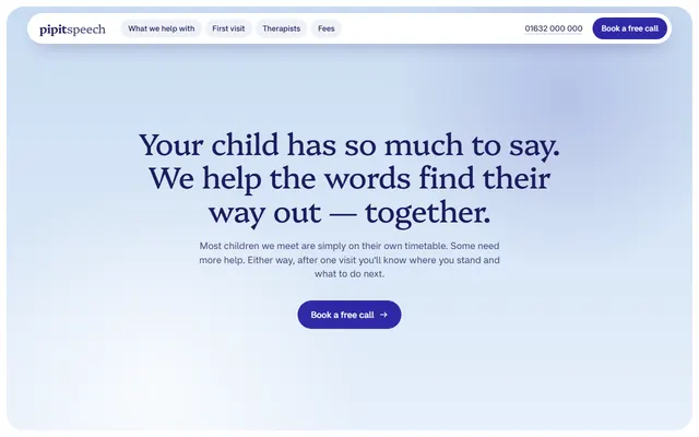
Speech and language therapy practice: five areas of help, a four-step first visit, four therapists, fees and a call request form.
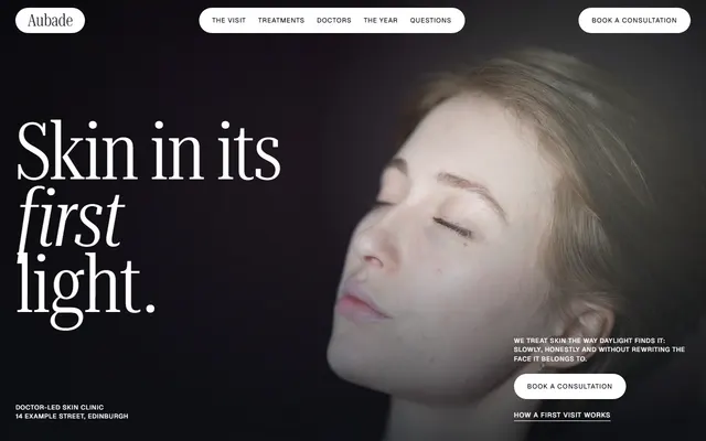
Skin clinic: a first visit plan, treatments with times and prices, doctors, a seasonal plan and a booking form.
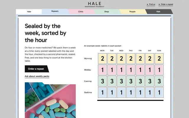
Neighbourhood pharmacy: weekly packs, a walk-in clinic, a vaccination table, opening hours and a form to order a repeat.
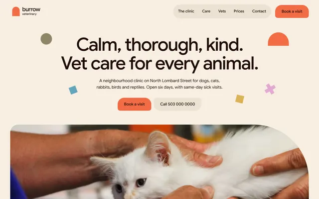
Vet clinic: services, vets, prices, recent patients and a visit request form.
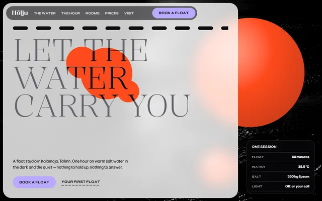
Float spa or wellness studio: the water, a session ticket, rooms, first-float guide, prices and a booking form.
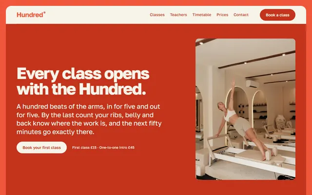
Pilates studio: class formats, a timetable, three prices and a booking form.
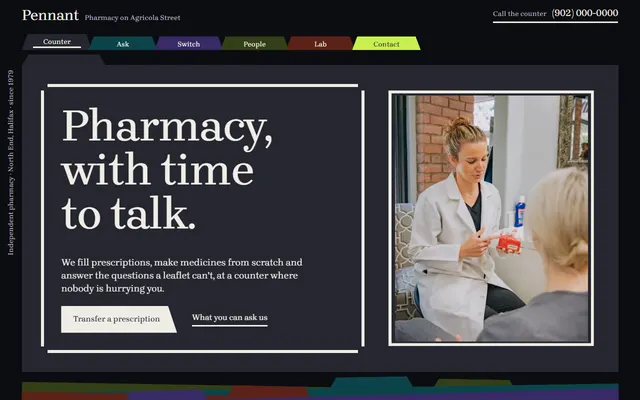
Independent pharmacy: services, prescription transfer, weekly packs, delivery rounds and a contact form.